Great yearbook spreads don’t happen by accident. They emerge from intentional design choices—strategic photo placement, thoughtful typography, balanced whitespace, and visual hierarchies that guide readers’ eyes exactly where you want them to go. Each two-page spread represents prime real estate in your yearbook, an opportunity to tell compelling stories that students will revisit for decades.
Yet many yearbook committees struggle with spread design, falling into repetitive patterns that make page after page feel identical. Advisers watch talented photography sit unused because no one knows how to build spreads around strong images. Design editors default to safe, predictable layouts that technically work but fail to capture the energy and personality that make yearbooks memorable. The result: publications that document the school year without celebrating it, books that end up in closets rather than on coffee tables.
This comprehensive guide delivers 35+ yearbook spread ideas spanning multiple layout categories—from foundational grid designs and portrait arrangements through dynamic sports action spreads, storytelling layouts, and contemporary design approaches. Each concept includes specific execution guidance addressing photo selection, typography choices, caption strategies, and design elements that transform ordinary pages into spreads worth keeping. You’ll also discover how digital yearbook platforms extend the life of these carefully crafted layouts, making them searchable and shareable for alumni decades after graduation.
The difference between average yearbook spreads and exceptional ones often comes down to intentional design thinking—understanding how readers interact with two-page layouts and crafting visual experiences that reward both quick browsing and detailed exploration.

Well-designed yearbook spreads deserve preservation beyond printed pages—digital platforms make these layouts accessible to alumni for decades
Understanding Effective Spread Design Principles
Before diving into specific layout ideas, grasping fundamental spread design principles helps yearbook staffs make confident decisions across all sections.
The Spread as a Single Canvas
The most important principle: treat facing pages as one unified design rather than two separate pages. Professional yearbook designers think in spreads, not pages.
Visual Unity Across the Gutter
Elements should flow across the center binding seamlessly. A dominant photo might span both pages. Headline text could start on the left page and complete on the right. Design elements—color blocks, graphic shapes, borders—can bridge the gutter to create cohesion.
Spreads that ignore the gutter feel disjointed. Readers subconsciously process facing pages as related content; designs that treat each page independently waste this natural reading behavior.
Establishing Clear Entry Points
Strong spreads guide readers’ eyes deliberately. Most readers enter a spread from the upper left, following western reading patterns. Effective designs acknowledge this tendency while creating visual interest that encourages exploration beyond linear reading.
Use size, contrast, color, and placement to establish viewing hierarchy:
- Dominant photos draw initial attention
- Headlines and large text create secondary entry points
- Captions and body copy reward closer inspection
- Small detail photos offer discovery moments for engaged readers
Creating Visual Balance Without Symmetry
Balanced spreads don’t require identical left and right pages. In fact, symmetrical spreads often feel static and formal. Instead, aim for visual equilibrium—distributing visual weight across the spread so neither side overwhelms the other.
Working With Visual Weight
Different elements carry different visual weights:
- Large photos command more attention than small ones
- High-contrast images attract eyes faster than subtle, low-contrast photos
- Warm colors (reds, oranges, yellows) feel heavier than cool colors (blues, greens)
- Dense text blocks create visual weight through darkness
- Whitespace lightens areas, giving eyes places to rest
Balance these weights across your spread. A large dominant photo on the left might balance with several smaller photos plus headlines on the right. A dark photo on one side might pair with lighter images plus colorful graphics on the other.
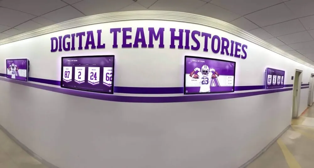
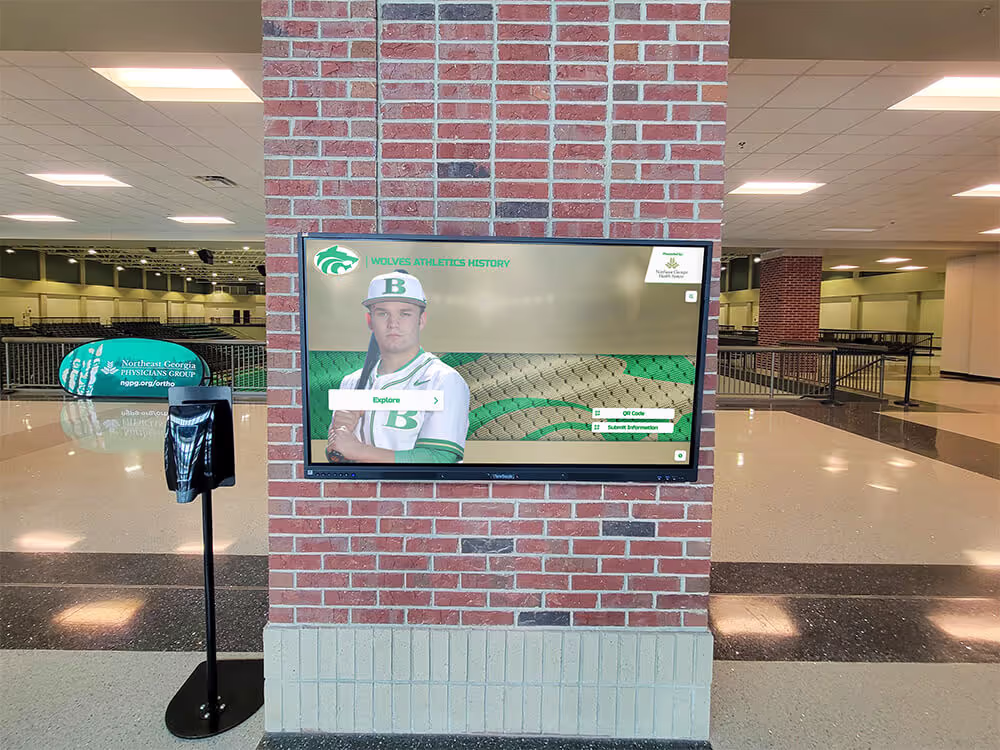
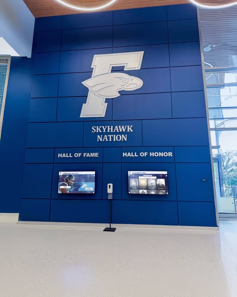
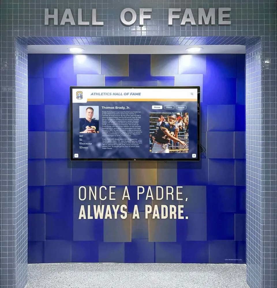
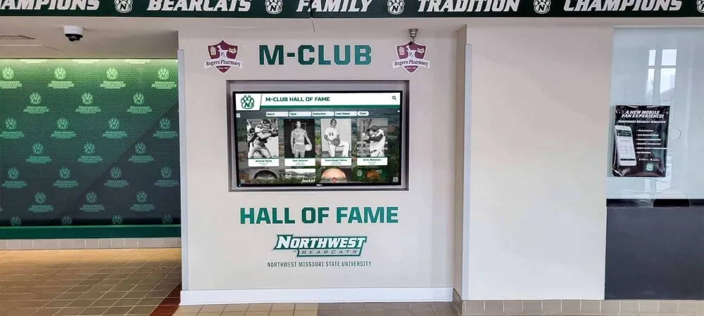
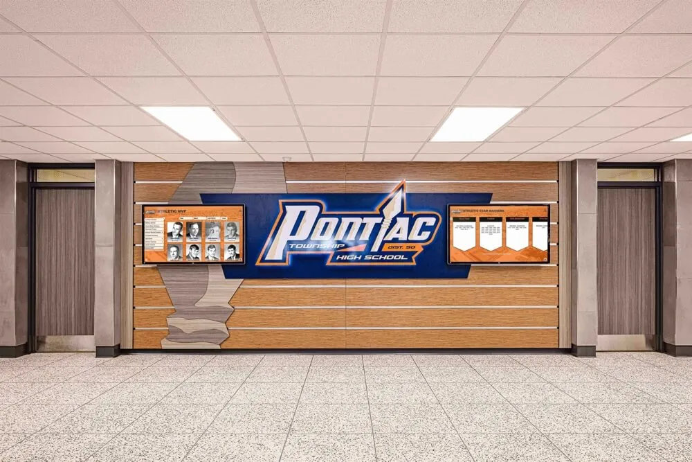
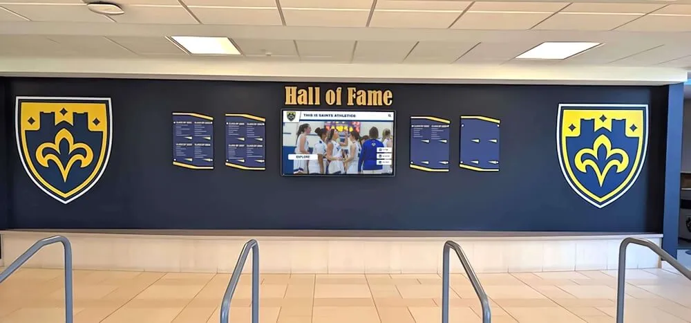
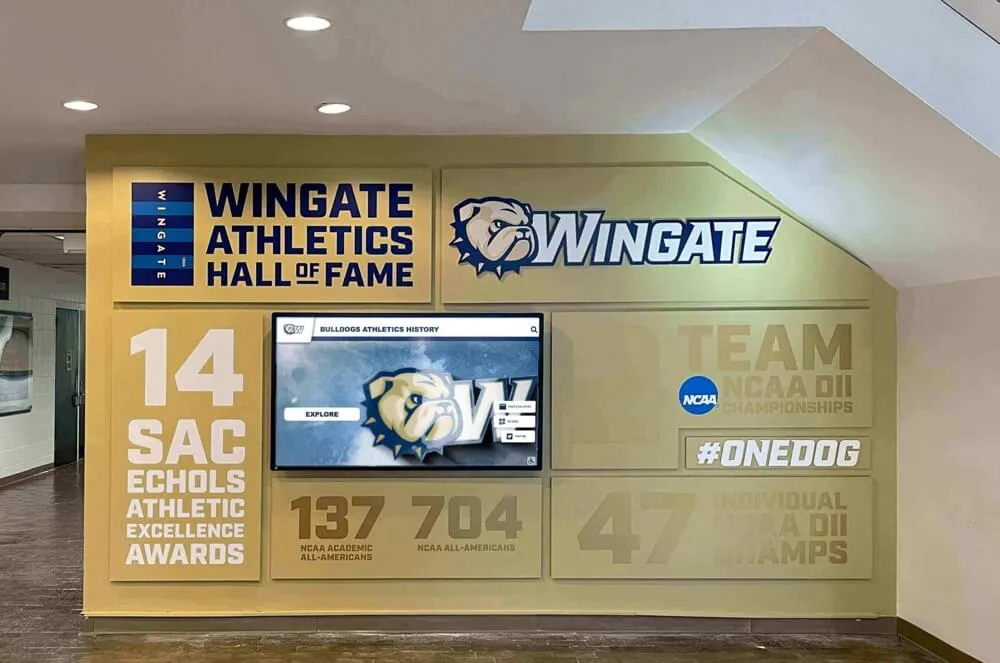
Many schools preserve their most creative spread designs in digital hall of fame displays that showcase yearbook excellence alongside athletic and academic achievements.

The visual principles that make yearbook spreads effective also translate beautifully to digital recognition displays throughout campus
Category 1: Foundation Grid Layouts
Grid-based spreads provide structure and consistency while remaining flexible enough for creative execution.
1. Classic Six-Shot Grid
Layout: Six equal-sized photos arranged in two rows of three, with headline and copy anchoring one corner.
When to Use: Club group photos, candid event coverage, academic department overviews, or any content requiring equal visual weight across multiple moments.
Execution Tips:
- Maintain consistent photo aspect ratios for visual harmony
- Use caption placement to create rhythm—all below images or alternating positions
- Add subtle color blocks behind photo groups to create unity
- Consider bleeding edge photos off the page for contemporary feel
- Vary horizontal and vertical orientations to add interest
This reliable workhorse layout accommodates diverse content while maintaining clean, organized presentation.
2. Dominant + Supporting Photos
Layout: One large dominant photo (occupying roughly 40-50% of spread) with 3-5 smaller supporting images.
When to Use: When you have one exceptional photo that deserves prominence—a championship-winning moment, a dramatic performance shot, a perfectly composed candid.
Execution Tips:
- Position the dominant photo to span both pages or anchor one full page
- Cluster supporting photos to create visual relationships
- Ensure supporting images complement rather than compete with the dominant shot
- Use the dominant photo to establish mood and energy
- Place headlines near but not directly over the dominant image
3. Mosaic Layout
Layout: Photos of varying sizes arranged like puzzle pieces to fill the spread, with minimal whitespace.
When to Use: High-energy events, spirit week coverage, comprehensive activity summaries, or sections showcasing visual variety.
Execution Tips:
- Maintain consistent spacing (gutters) between all photos for cohesion
- Vary sizes dramatically—mix large statement photos with small detail shots
- Create alignment lines—edges of different photos should line up even when sizes differ
- Use the mosaic complexity intentionally; pair with simple typography
- Consider uniform border treatments to unify disparate photo sizes
4. Modular Grid
Layout: Content organized in clear rectangular modules—photo blocks, text blocks, graphic elements—arranged on an underlying grid.
When to Use: Information-dense spreads like senior portraits with quotes, academic award listings with photos, or content mixing multiple information types.
Execution Tips:
- Establish a clear grid (perhaps 12 or 16 columns) and stick to it
- Create modules that span 2, 3, 4, or more grid columns
- Use background colors or subtle borders to define modules clearly
- Maintain consistent spacing between modules
- Vary module sizes to prevent monotony while respecting the grid
The modular approach works particularly well for content that needs to be searchable in digital formats, as it creates clear information containers that translate effectively to interactive platforms.
5. Horizontal Bands
Layout: Spread divided into horizontal bands (typically 2-4), each containing related photos and content.
When to Use: Timeline-style content, progression narratives, before-and-after features, or content naturally organized into distinct categories.
Execution Tips:
- Vary band heights to create visual interest
- Use alternating background colors or treatments to distinguish bands
- Allow some photos to break out of bands for dynamic energy
- Create clear visual separation between bands with rules, whitespace, or color
- Consider bands as miniature spreads within the larger spread

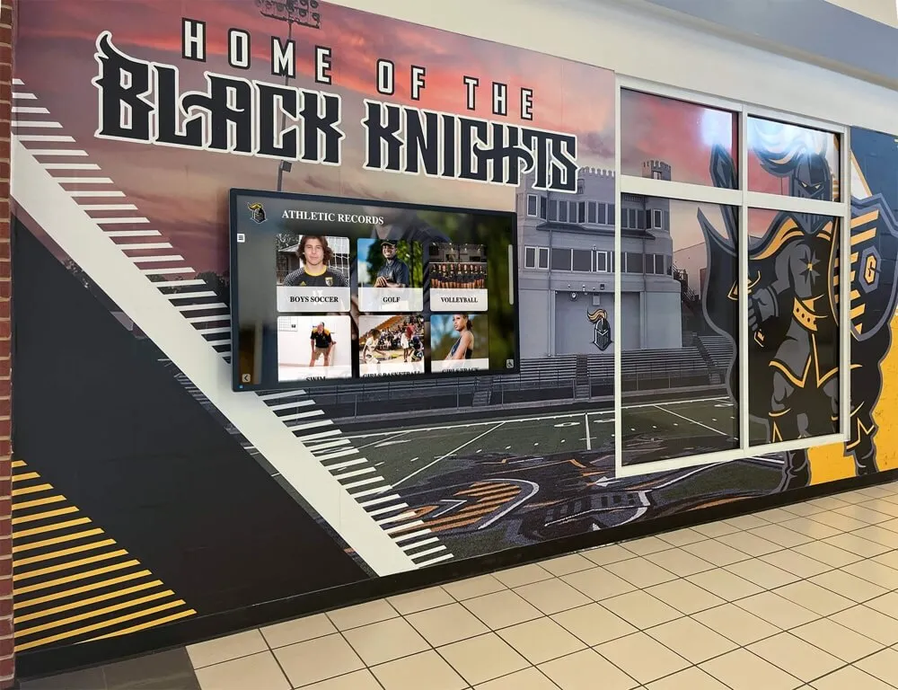
Horizontal band layouts organize complex information clearly, a principle that works across both printed spreads and digital displays
Category 2: Portrait and People Layouts
Spreads featuring people require special consideration for faces, expressions, and human connection.
6. Floating Portraits
Layout: Individual portraits “float” on colored or textured backgrounds with ample whitespace around each person.
When to Use: Senior portraits, club member introductions, faculty features, or award recipient showcases.
Execution Tips:
- Ensure consistent lighting and background treatment across portraits
- Maintain uniform sizing for all portraits to emphasize equality
- Use color-coded backgrounds to indicate different categories or groups
- Include name labels and brief identifying information with each portrait
- Consider silhouetting subjects (removing backgrounds) for contemporary look
7. Candid Storytelling Grid
Layout: Candid photos arranged in a loose grid showing authentic moments and genuine interactions.
When to Use: Day-in-the-life features, event coverage emphasizing participation over formal documentation, or culture showcases.
Execution Tips:
- Capture varied moments—wide shots establishing context, medium shots showing interaction, close-ups revealing emotion
- Avoid staged or posed shots; prioritize genuine expressions and natural behavior
- Use photo sizes to emphasize the most compelling moments
- Include environmental context showing where moments happened
- Write captions that identify not just people but also the moment’s significance
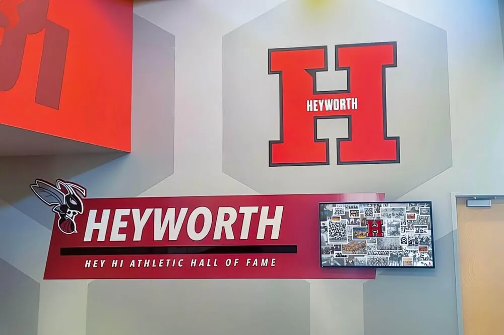
Schools increasingly recognize the value of preserving candid yearbook moments beyond print, implementing digital archiving solutions that make these authentic student experiences searchable decades later.
8. Quote-Driven Profiles
Layout: Large pull quotes paired with portrait photos and supporting body copy.
When to Use: Student voice features, opinion pieces, “Why I Love…” series, senior reflections, or perspective pieces.
Execution Tips:
- Select quotes that reveal personality, not generic statements
- Use large, bold typography for quotes—make them visually dominant
- Position portrait photos near but not obscuring the speaker’s words
- Include attribution and context for each quote
- Consider pull-quote graphic treatments—oversized quotation marks, color blocks, distinctive typefaces
9. Environmental Portraits
Layout: Subjects photographed in meaningful environments that reveal identity or activity—athletes in competition spaces, artists in studios, students in favorite campus locations.
When to Use: Profile features, “Humans of [School Name]” series, senior spotlights, or personality showcases.
Execution Tips:
- Choose environments that communicate something specific about subjects
- Use wider shots that show significant environmental context
- Ensure subjects remain focal points despite environmental detail
- Capture interaction with the environment, not just standing in it
- Write captions explaining the location’s significance to the subject
10. Action Sequence
Layout: Multiple photos showing progressive moments in a single action—a play unfolding, a routine progressing, a process developing.
When to Use: Sports coverage, performing arts features, lab science experiments, or any activity with visual progression.
Execution Tips:
- Shoot sequences intentionally; anticipate and capture key progression moments
- Arrange photos in clear chronological order (typically left to right)
- Maintain consistent framing and perspective across sequence images
- Use numbering or arrows to emphasize sequential nature
- Include captions explaining what viewers see at each stage

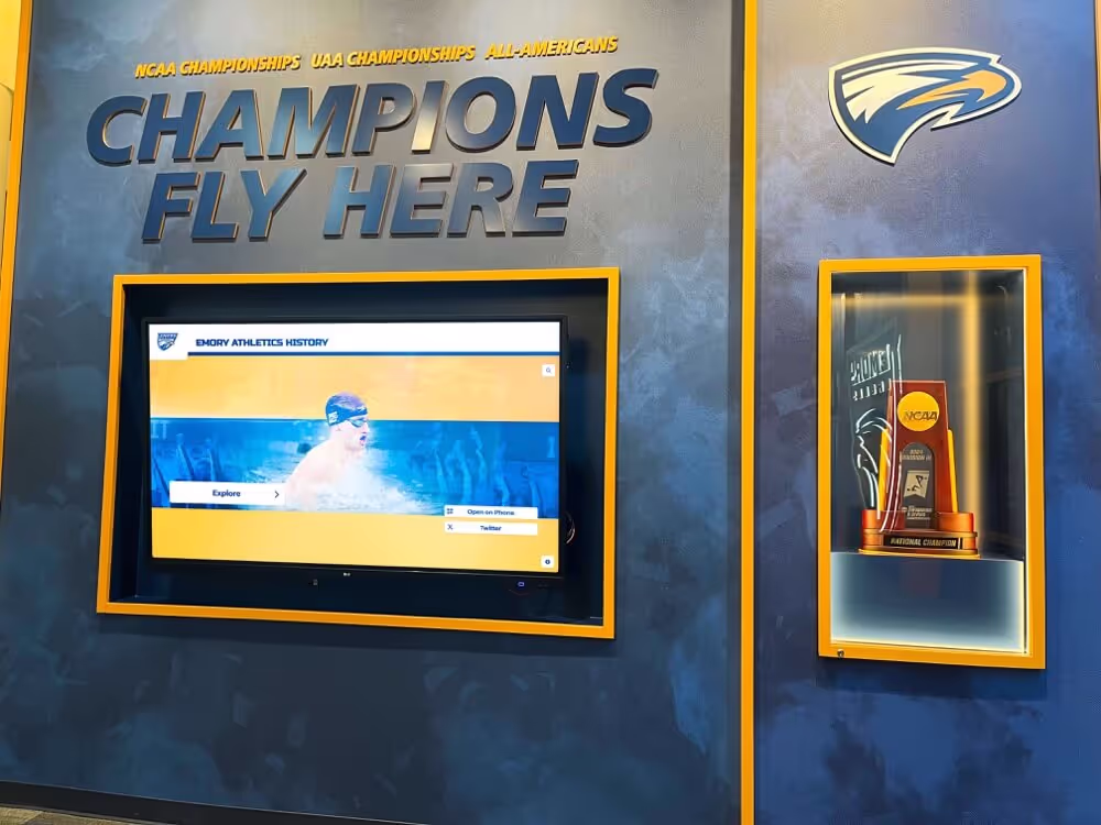
Portrait layouts designed for yearbook spreads translate effectively to interactive digital platforms where alumni can search for themselves and classmates
Category 3: Sports and Action Layouts
Athletic coverage demands layouts that convey motion, energy, and competitive intensity.
11. Full-Bleed Action Shot
Layout: One dramatic action photo bleeding off all edges of the spread, with text and supporting elements overlaid.
When to Use: Championship coverage, record-breaking performances, season highlights, or when you have a truly exceptional action photograph.
Execution Tips:
- Select action photos with clear subjects and uncluttered backgrounds
- Ensure text overlays maintain readability (use drop shadows, color blocks, or transparent overlays)
- Position text in less visually complex areas of the photo
- Consider the gutter placement—avoid having critical action happening exactly where pages meet
- Use this dramatic layout sparingly for maximum impact
12. Stats + Action Combination
Layout: Action photos paired with statistical graphics, record charts, or performance data.
When to Use: Season recap spreads, athlete spotlights, team overviews, or record-breaking performance recognition.
Execution Tips:
- Create clear visual distinction between photos and data graphics
- Use infographic-style presentations for statistics (charts, graphs, visual comparisons)
- Ensure numbers are large, legible, and meaningful
- Connect statistics to specific photos when possible
- Consider color-coding different statistical categories
13. Team Grid with Context
Layout: Team photo or roster grid combined with season narrative, key moments, and standout individual shots.
When to Use: Comprehensive team spreads balancing group documentation with season storytelling.
Execution Tips:
- Position team photo or roster prominently but not overwhelmingly
- Select 3-5 season-defining moments for supporting photos
- Include game highlights, practice moments, and team bonding shots
- Create hierarchy—team photo largest, defining moments medium, detail shots smallest
- Add season record, championships, and significant achievements prominently
14. Before/During/After Narrative
Layout: Sports coverage showing preparation, competition, and celebration phases.
When to Use: Championship game coverage, season journey narratives, or tournament progression stories.
Execution Tips:
- Use section headers or visual dividers to mark the three phases clearly
- Show preparation (locker room, warm-ups, focused faces)
- Capture competition (game action, sideline intensity, crucial plays)
- Document aftermath (celebration, disappointment, reflection, team bonding)
- Create visual progression through color temperature, energy level, or photo treatment
15. Athlete Spotlight Series
Layout: Consistent template repeated across spreads featuring individual athletes with photos, stats, quotes, and achievements.
When to Use: Senior athlete recognition, MVP features, milestone achievement celebrations, or record-holder tributes.
Execution Tips:
- Create a template and stick to it across all athletes for consistency
- Include both action and portrait photos
- Feature meaningful statistics, not just volume numbers
- Add personal quotes revealing athlete perspective
- Include career highlights and memorable moments
- Consider team colors in design elements

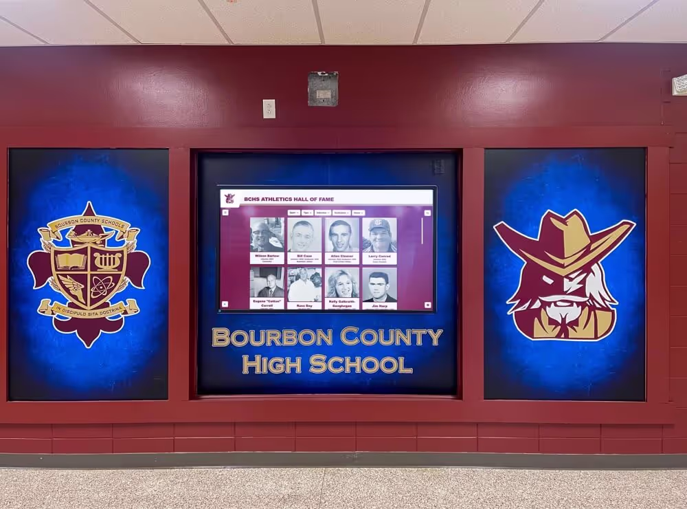
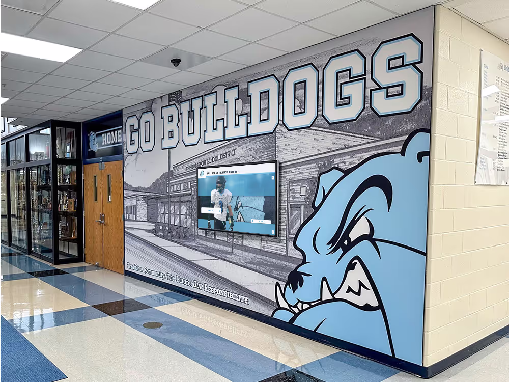
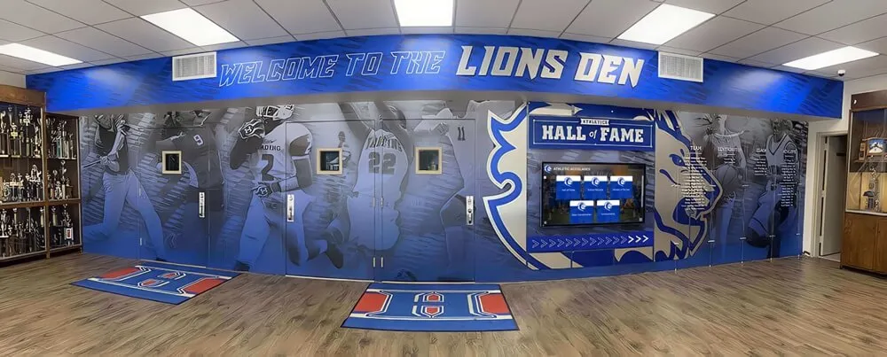
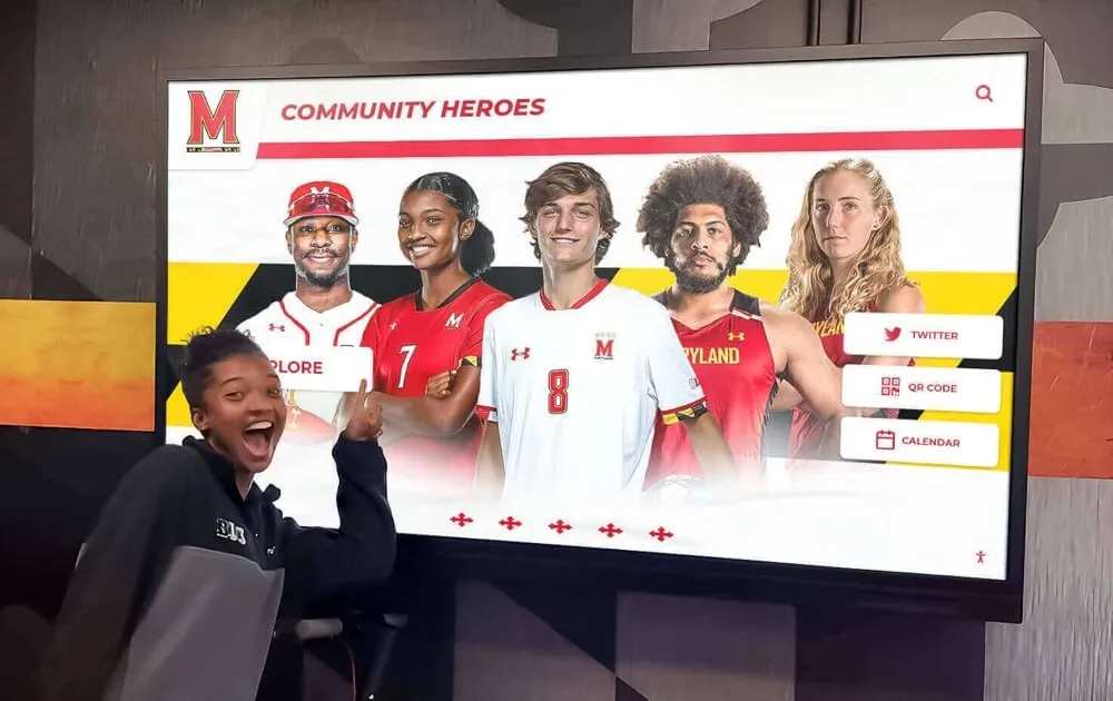
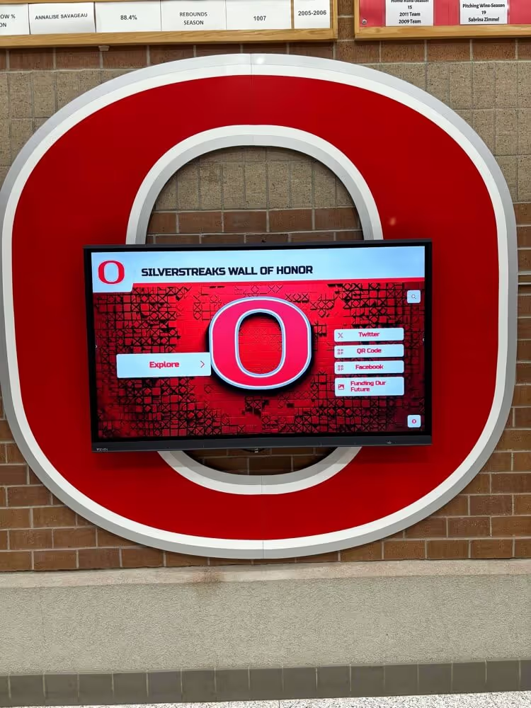
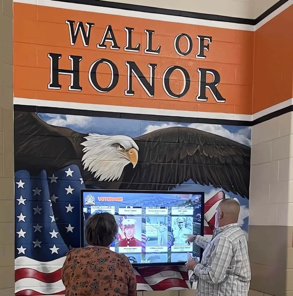
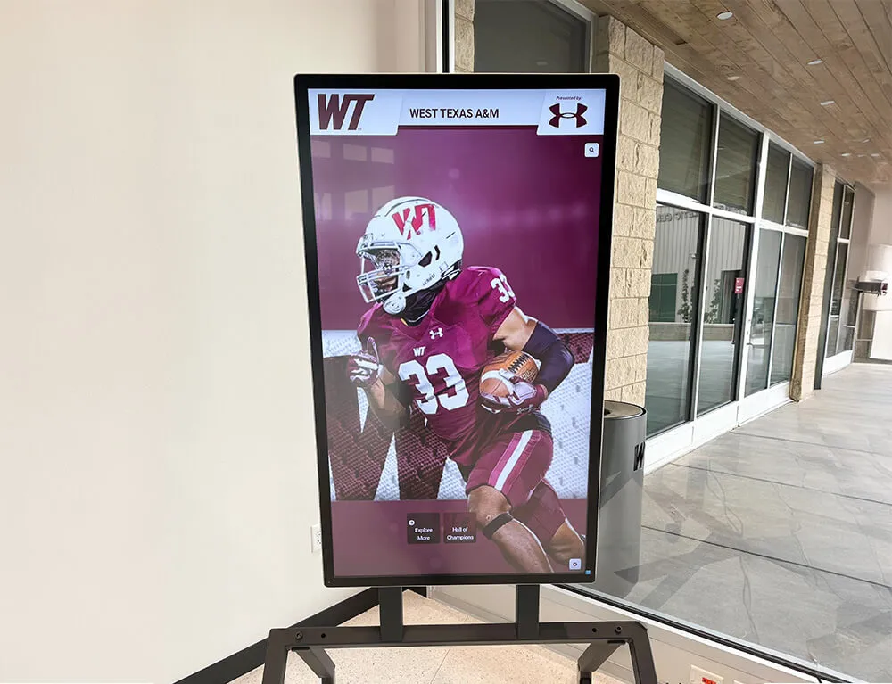
Athlete spotlight spreads designed for yearbooks can live on in digital recognition displays celebrating achievements for decades
Category 4: Event Coverage Layouts
Event spreads capture atmosphere, participation, and memorable moments from school gatherings.
16. Timeline Spread
Layout: Event coverage organized chronologically from beginning to end, often using a visual timeline element.
When to Use: Homecoming coverage, prom features, graduation ceremonies, or multi-part events with clear progression.
Execution Tips:
- Create an actual timeline graphic running across the spread
- Select photos representing key moments throughout the event
- Use time stamps or sequence numbers with photos
- Show progression—setup, early moments, peak energy, conclusion
- Include photos of different participants across the timeline
17. Multi-Perspective Coverage
Layout: Same event shown from different stakeholder perspectives—students, teachers, parents, performers, audience.
When to Use: All-school events, performances, assemblies, or gatherings involving multiple distinct groups.
Execution Tips:
- Label or organize sections by perspective clearly
- Capture photos that show each group’s unique experience
- Use quotes from different perspectives to enhance understanding
- Consider visual coding (colors, icons, borders) to distinguish perspectives
- Balance space given to different viewpoints
18. Atmosphere + Detail Combination
Layout: Wide environmental shots establishing event atmosphere paired with close-up detail shots revealing character.
When to Use: Dances, spirit events, themed gatherings, or visually rich celebrations.
Execution Tips:
- Use wide shots to show crowds, decorated spaces, overall energy
- Pair with close-ups of decorations, expressions, small interactions, meaningful details
- Create size contrast—large atmospheric shots, smaller detail images
- Use details to reveal personality and specific moments
- Write captions connecting details to larger event narrative
19. Photo Essay Spread
Layout: Photojournalistic approach with 5-8 photos telling a complete event story with minimal text.
When to Use: Events where strong photography can carry the narrative—community service projects, performances, competitions, or emotionally resonant gatherings.
Execution Tips:
- Select photos representing complete story arc—beginning, development, climax, resolution
- Vary shot types—establishing shots, action shots, reaction shots, detail shots
- Use minimal text; let photos communicate
- Arrange photos in narrative sequence
- Write brief, powerful captions that add context without explaining obvious visuals
20. Before and After Transformation
Layout: Split spread showing “before” state on one side and “after” result on the other.
When to Use: Homecoming court reveals, makeover fundraisers, facility renovations, or transformation-based events.
Execution Tips:
- Use clear visual division down the center gutter
- Mirror compositions on both sides when possible
- Label “before” and “after” clearly
- Include process photos showing transformation stages
- Add narrative text explaining the change
- Consider visual treatments reinforcing contrast (black and white vs. color, muted vs. vibrant)
Category 5: Academic and Classroom Layouts
Academic spreads face the challenge of making learning moments visually compelling.
21. Subject Showcase Grid
Layout: Grid of photos showing different aspects of a single academic subject—lectures, labs, discussions, projects, presentations.
When to Use: Academic department spreads, subject area overviews, or curriculum highlights.
Execution Tips:
- Include variety—teacher instruction, student collaboration, independent work, presentations, finished projects
- Show different classroom configurations and learning modes
- Feature diverse students across different classes
- Include close-ups of academic work, materials, tools, and technology
- Add brief descriptions of what students learn in each area
22. Project Process Documentation
Layout: Multi-photo layout showing academic project from conception through completion.
When to Use: Senior projects, science fair features, art shows, research presentations, or significant academic undertakings.
Execution Tips:
- Document process stages: planning, research, creation, refinement, presentation
- Show students actively working, not just finished products
- Include challenge moments and problem-solving
- Feature finished work prominently
- Add student quotes about learning and discovery
23. Student Work Gallery
Layout: Showcase of student-created academic work—essays, artwork, projects, designs, compositions.
When to Use: Writing features, art program spreads, design class highlights, or showcasing academic excellence.
Execution Tips:
- Photograph work professionally with even lighting
- Include artist/author attribution with each piece
- Add brief statements from creators about their work
- Show variety across different students and approaches
- Consider thematic organization or chronological progression
- Ensure reproduction quality for written work and detailed art
24. Day in the Life—Academic Focus
Layout: Following one or multiple students through their academic day, showing different classes and learning experiences.
When to Use: Schedule diversity features, academic rigor showcases, or typical student experience documentation.
Execution Tips:
- Select students with diverse schedules
- Capture moments from each period or subject area
- Include transitions—hallways, lockers, moving between classes
- Show different teaching styles and classroom environments
- Add time stamps and class labels
- Include student reflection on their academic experience
25. Teacher Feature Spread
Layout: Highlighting educators with classroom action shots, student testimonials, and teaching philosophy elements.
When to Use: Faculty appreciation spreads, retirement tributes, teacher of the year features, or educator recognition.
Execution Tips:
- Show teachers actively teaching, not just posing
- Include student testimonials or quotes about impact
- Feature classroom environment and teaching style
- Add brief biography or fun facts
- Show teacher-student interaction and relationships
- Include both serious instructional moments and lighter personality moments

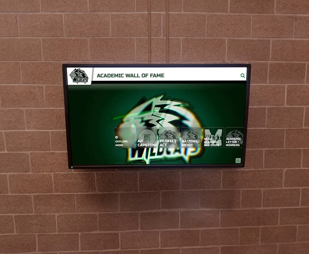
Academic recognition spreads translate beautifully to digital displays that can be updated regularly while preserving yearbook-style layouts
Category 6: Creative and Contemporary Layouts
Modern yearbook design increasingly embraces bold, unconventional approaches.
26. Magazine Editorial Style
Layout: Text-heavy spread with editorial design elements—large pull quotes, multi-column text, sidebar elements, and supporting photography.
When to Use: Opinion pieces, in-depth features, investigative journalism, or long-form storytelling.
Execution Tips:
- Use professional magazine layouts as inspiration
- Create clear visual hierarchy through type size and weight
- Break text into readable chunks with subheads
- Include pull quotes highlighting compelling statements
- Add sidebar elements—statistics, timelines, related facts
- Use photography to support but not dominate narrative
27. Infographic Dominant
Layout: Data visualization and infographic elements as primary content with supporting photos.
When to Use: Survey results, school statistics, demographic data, budget information, or quantitative storytelling.
Execution Tips:
- Design clear, accurate data visualizations
- Use charts, graphs, icons, and illustrated statistics
- Maintain consistent color coding across all data elements
- Include data sources and survey methodology
- Add contextual photos showing what numbers represent
- Write clear headlines and supporting text explaining data significance
28. Scrapbook/Collage Style
Layout: Overlapping photos, torn edges, handwritten elements, and intentionally informal arrangement.
When to Use: Nostalgia-driven content, senior memories, friend group features, or informal event coverage.
Execution Tips:
- Use intentional randomness—plan the informal look carefully
- Include memorabilia elements—tickets, notes, small keepsakes (photographed)
- Vary photo angles slightly for casual feel
- Add handwritten-style fonts for captions and notes
- Use digital scrapbooking elements sparingly to avoid dated look
- Ensure readability despite informal arrangement
29. Bold Typography as Design Element
Layout: Oversized typography functioning as graphic element, with photos integrated into or around large text.
When to Use: Section dividers, thematic spreads, quote collections, or design-forward features.
Execution Tips:
- Select bold, readable typefaces
- Make type truly large—filling significant spread space
- Integrate photos within letter shapes or alongside text
- Use high contrast between text and background
- Consider text as shape and texture, not just communication
- Limit to short text—single words or brief phrases work best
30. Negative Space Showcase
Layout: Generous whitespace as intentional design element, with carefully placed minimal content.
When to Use: Reflective content, minimalist aesthetic sections, or creating visual breathing room after busy spreads.
Execution Tips:
- Use whitespace purposefully, not as absence of content
- Position elements with careful precision
- Create clear focal points in spacious layouts
- Consider whitespace as positive design element
- Use restraint with photos and text
- Ensure the minimal approach serves content purpose
31. Color Block Organization
Layout: Bold geometric color blocks organizing and containing photos, text, and graphic elements.
When to Use: Contemporary design sections, creating visual unity across diverse content, or establishing clear content zones.
Execution Tips:
- Select colors aligned with school identity or theme
- Use blocks to create clear content containers
- Overlap blocks and photos for dynamic layering
- Maintain consistent block shapes across related spreads
- Ensure text readability on colored backgrounds
- Create visual rhythm through block repetition and variation
32. Diagonal Energy
Layout: Photos, text, and design elements arranged on diagonal axes rather than traditional horizontal/vertical grid.
When to Use: High-energy event coverage, spirit week documentation, or content needing dynamic, active visual treatment.
Execution Tips:
- Commit fully to diagonal approach; mixing with straight elements creates confusion
- Maintain consistent diagonal angles throughout spread
- Use diagonal lines and shapes as design elements
- Ensure text remains readable despite angular placement
- Create directional flow guiding eye movement
- Balance diagonal dynamism with readable content
33. Frame Within Frame
Layout: Photos framed within graphic shapes, borders, or photographic frames creating layered composition.
When to Use: Creating visual depth, highlighting important content, or adding graphic interest to straightforward photos.
Execution Tips:
- Vary frame shapes—circles, rounded rectangles, polygons, organic shapes
- Use frames to create visual relationships between photos
- Layer frames for depth
- Consider frame colors and weights carefully
- Ensure frames enhance rather than overwhelm photos
- Create consistency through repeated frame shapes and styles
34. Split Screen Comparison
Layout: Spread divided vertically or horizontally comparing two related but distinct elements.
When to Use: Rivalry coverage, comparison features, then-and-now content, or contrasting perspectives.
Execution Tips:
- Create clear visual division line
- Mirror layouts on both sides for direct comparison
- Use color coding to distinguish sides
- Include comparative text highlighting similarities and differences
- Show equivalent content types on both sides
- Consider visual treatments reinforcing comparison (warm vs. cool colors, light vs. dark)
35. Circular Flow Layout
Layout: Photos and elements arranged in circular or curved pattern creating visual movement around the spread.
When to Use: Cyclical content, seasonal themes, continuous processes, or creating dynamic visual energy.
Execution Tips:
- Establish clear circular path through photo placement
- Use curved design elements reinforcing circular flow
- Position text along or near the circular path
- Create entry and exit points guiding eye movement
- Vary photo sizes while maintaining circular arrangement
- Consider the circle’s center as potential focal point

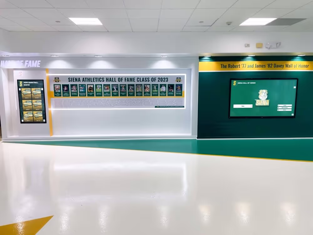
Individual profile layouts designed for yearbook spreads adapt perfectly to interactive digital platforms preserving student achievements
Category 7: Special Feature Layouts
Unique content types require purpose-built spread approaches.
36. Senior Superlatives
Layout: Superlative award categories with winner photos, names, and sometimes playful descriptions.
When to Use: Senior recognition features, class awards, or personality-based features.
Execution Tips:
- Create consistent template for each superlative
- Use playful design elements matching award tone
- Include both individual and paired superlatives
- Show winners in character—photos reflecting award category
- Consider including runner-ups or honorable mentions
- Add brief descriptions or quotes from winners
37. Then and Now
Layout: Historical photos paired with contemporary equivalents showing change over time.
When to Use: Anniversary features, facility renovations, tradition evolution, or alumni connection content.
Execution Tips:
- Match compositions between historical and current photos when possible
- Use clear labels identifying time periods
- Include narrative text explaining changes
- Show both dramatic transformations and surprising continuities
- Consider layouts putting old and new side by side
- Add context about what remained constant despite changes
38. School Traditions Explained
Layout: Multi-photo spreads documenting and explaining unique school traditions, rituals, or customs.
When to Use: Capturing institutional culture, orienting new families, or preserving unique traditions.
Execution Tips:
- Show traditions in action, not just described
- Include historical context explaining tradition origins
- Feature diverse participation across different groups
- Add quotes from participants about tradition meaning
- Show different aspects or moments within single traditions
- Consider year-over-year evolution of traditions
39. A Year in Photos—No Text
Layout: Powerful image-only spread showcasing the year’s best photography without captions or headlines.
When to Use: Photography showcase, year-in-review features, or powerful visual storytelling moments.
Execution Tips:
- Select only the strongest, most compelling photos
- Ensure images tell clear stories without text support
- Create visual flow and narrative arc through photo sequence
- Vary photo sizes to create hierarchy and rhythm
- Include diverse content types and moments
- Let photography carry complete narrative weight
Extending Spread Layouts to Digital Platforms
The carefully crafted spread layouts yearbook staffs create deserve life beyond printed pages. Modern digital yearbook platforms preserve these design decisions while adding searchability, shareability, and perpetual accessibility.
Digital Preservation Without Design Compromise
Contemporary yearbook digitization technology maintains original layout integrity:
Layout Fidelity
- High-resolution scanning captures design details, typography choices, and photo quality
- Interactive platforms present spreads as designed, not reformatted for screens
- Zoom capabilities let alumni explore fine details in layouts
- Two-page spread views preserve the unified design thinking behind facing pages
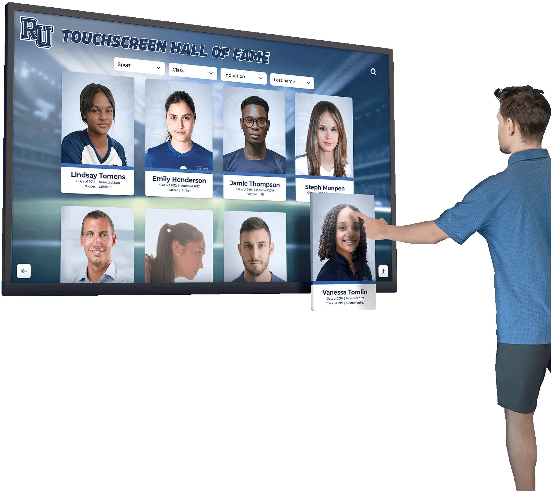
Enhanced Discoverability
Digital platforms add functionality impossible in print:
- Name recognition technology makes every person in every photo searchable
- Alumni can find all their appearances across multiple yearbooks
- Keyword tagging enables content discovery beyond linear page-turning
- Sharing tools let alumni send specific spreads to classmates decades later
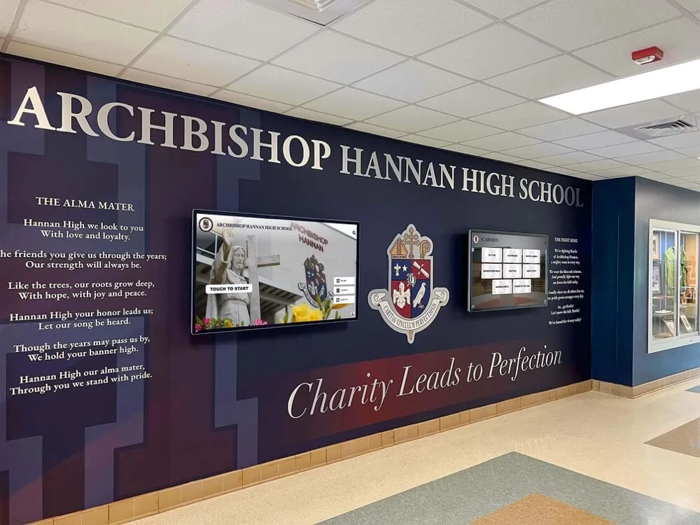
Many schools now create yearbook spreads with dual purposes—immediate print impact plus long-term digital accessibility through platforms like digital yearbook archives that preserve layouts while adding search and sharing capabilities.
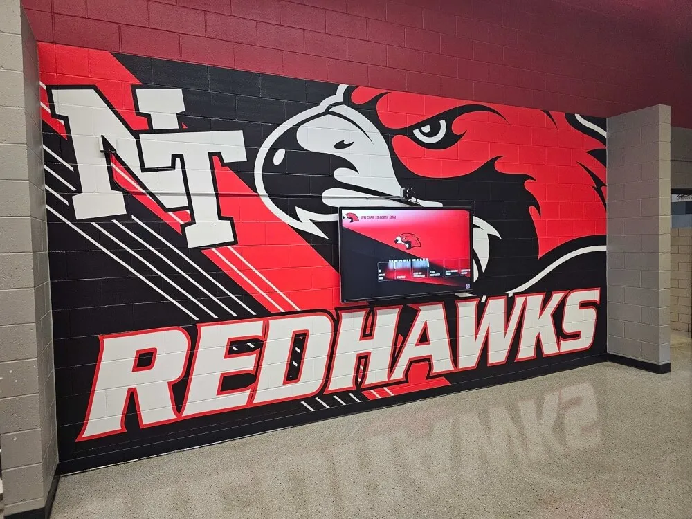
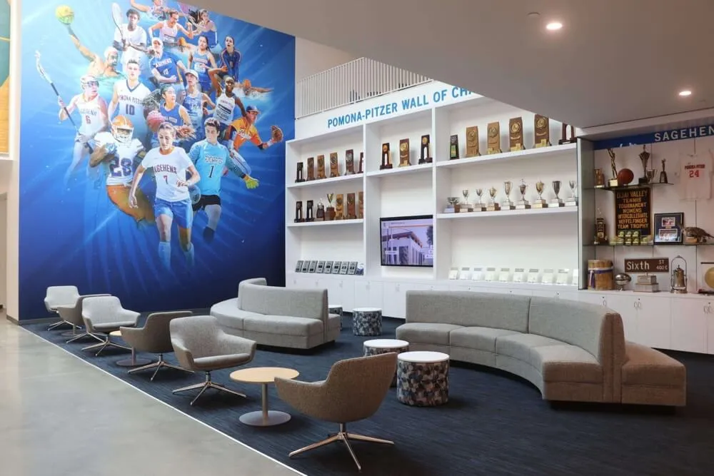
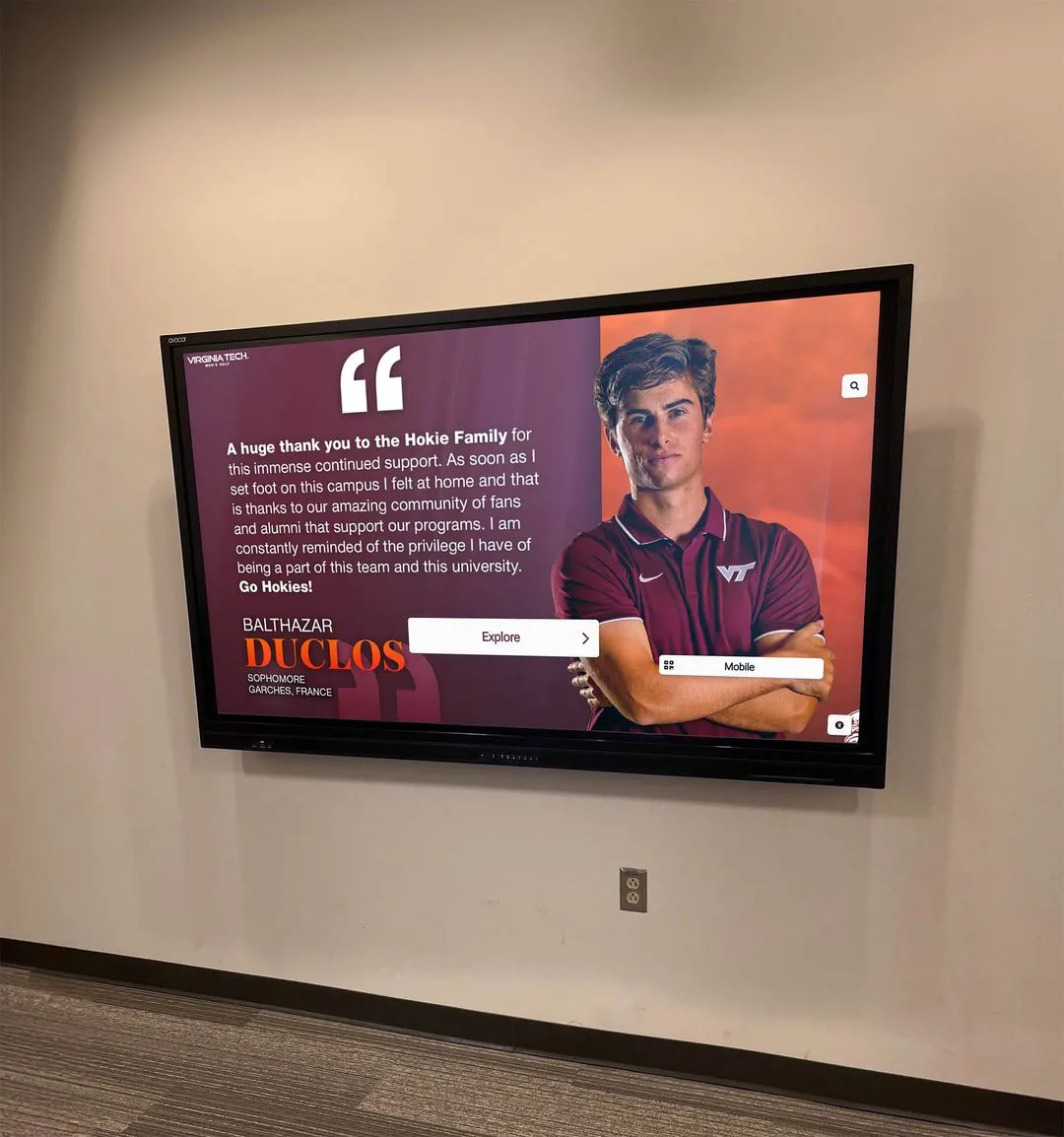
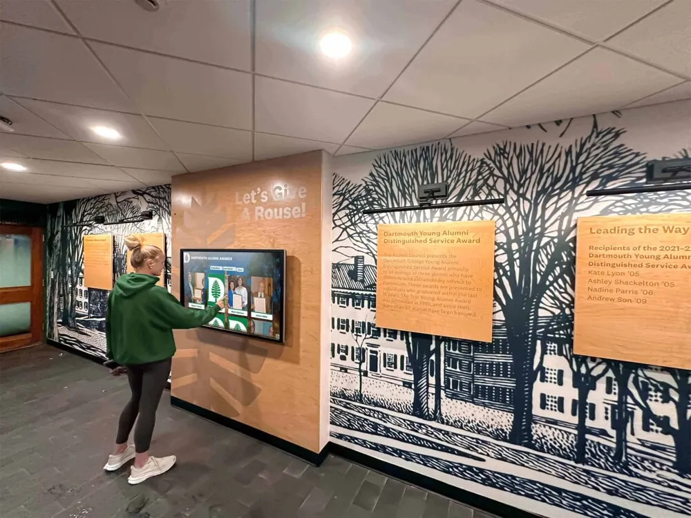
Interactive Display Applications
Creative spread layouts also inspire interactive recognition displays throughout campus:
Lobby Installations
- Touchscreen displays showcasing yearbook spreads in high-traffic areas
- Visitors can browse current and historical yearbook content
- Search functionality helps alumni find themselves quickly
- Rotating featured spreads highlight different content regularly
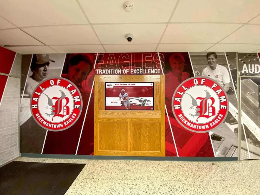
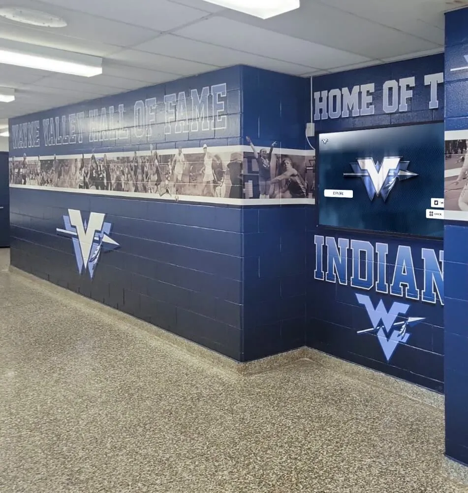
Athletic Facilities
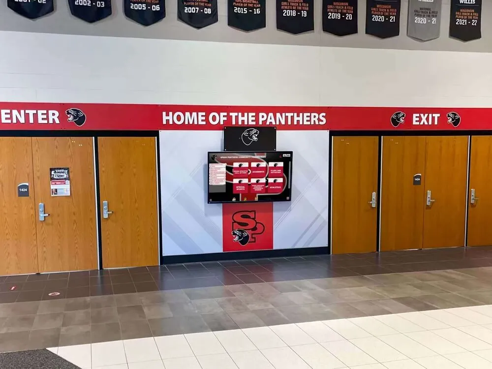
Sports spread layouts translate effectively to digital recognition boards:
- Championship spreads displayed permanently in competition venues
- Record-breaking moment documentation
- Team history presentations using yearbook-style layouts
- Athlete profile displays inspired by yearbook spotlight spreads
Alumni Spaces
Graduate lounges and alumni centers benefit from yearbook content:
- Nostalgic browsing opportunities for returning alumni
- Reunion planning resources showing classmate photos
- Historical institutional documentation
- Connection points encouraging alumni engagement
The design principles that make printed yearbook spreads effective—clear hierarchy, intentional photo selection, balanced layouts, thoughtful typography—serve equally well in digital applications while gaining searchability and shareability.
Practical Execution: From Concept to Finished Spread
Understanding layout concepts means little without practical execution skills. Strong yearbook programs develop systematic approaches to spread production.
Pre-Design Planning
Successful spreads begin before opening design software:
Content Inventory
- What photos are available for this spread?
- What quality level are they (lighting, composition, technical execution)?
- What range do they cover (wide shots, medium shots, close-ups, details)?
- What written content exists (copy length, caption information, quotes)?
- What must be included versus what’s optional?
Spread Objectives
- What story does this spread tell?
- What should readers remember after viewing it?
- What emotions should it evoke?
- Who is the primary audience?
- How does it connect to surrounding spreads and overall book narrative?
Layout Selection
With inventory and objectives clear, match appropriate layout types:
- Do you have one dominant photo or multiple equal-weight images?
- Is this high-energy content or reflective content?
- Does the content contain inherent organization (timeline, categories, progression)?
- What page number and section establishes context?
- What layouts appear on surrounding spreads (avoid excessive repetition)?
Design Execution Best Practices
Once you’ve selected a layout approach:
Establish Grid and Guides
- Set up column grids before placing content
- Create horizontal guides dividing vertical space
- Establish consistent margins around spread edges
- Mark gutter area where binding occurs
Photo Placement Strategy
- Place dominant photo first to anchor spread
- Add supporting photos in order of importance
- Create intentional relationships through proximity and alignment
- Maintain consistent spacing between photos
- Ensure photos don’t create awkward visual tangents or unfortunate crops
Typography Hierarchy
- Establish clear type scale (headline, subhead, body, caption sizes)
- Limit typeface variety (typically 2-3 fonts maximum)
- Create sufficient contrast between text levels
- Ensure readability at actual print size
- Use type weight and style variations purposefully
Whitespace Management
- Build in breathing room around content
- Use whitespace to separate distinct content areas
- Create margins that frame rather than crowd content
- Consider whitespace as active design element, not leftover space
Quality Control Checklist
Before finalizing spreads:
Technical Verification
- Are all photos high resolution (300 dpi at final size)?
- Do photos have appropriate color correction?
- Is all text spelled correctly?
- Are names verified and accurate?
- Do page numbers, headers, and footers display correctly?
Design Assessment
- Does the spread have clear visual hierarchy?
- Do facing pages work as unified design?
- Is there appropriate balance across the spread?
- Does the layout guide eyes intentionally?
- Have you avoided common design pitfalls (awkward crops, orphaned text, tangents)?
Content Completeness
- Are all required elements present?
- Do captions identify all people and provide context?
- Does copy connect to photos meaningfully?
- Are photo credits included where required?
- Does the spread tell a complete story?
Digital Yearbook Solutions: Preserving Layouts for Generations
Once you’ve invested creative effort into exceptional spread designs, preserve them properly. Digital yearbook platforms ensure these layouts remain accessible and searchable for alumni decades after graduation.
Modern solutions offer:
Comprehensive Digitization
- Professional scanning maintaining layout quality and design detail
- OCR text recognition making names and content searchable
- Cloud hosting ensuring perpetual accessibility
- Mobile-responsive presentation adapting spreads for any screen size
Alumni Engagement Features
- Name tagging enabling “find yourself” functionality
- Sharing tools for sending spreads to classmates
- Commenting and memory-sharing capabilities
- Integration with reunion planning and alumni communications
Institutional Benefits
- Preservation backup protecting against physical deterioration
- Space savings eliminating physical storage requirements
- Fundraising applications leveraging alumni nostalgia
- Historical documentation serving research and archives needs
Schools committed to long-term memory preservation increasingly pair traditional yearbook programs with digital archiving, recognizing that today’s carefully designed spreads deserve accessibility matching their quality.
Want to explore how your yearbook spreads could live on through interactive digital platforms? Modern solutions make professionally designed yearbook content searchable, shareable, and perpetually accessible to your alumni community.
Getting Started: Implementing Better Spread Design
Improving yearbook spread quality doesn’t require complete program overhaul. Incremental improvements yield significant results.
Build a Spread Design Template Library
Create 8-10 versatile spread templates your staff can adapt:
- Three grid-based layouts (classic grid, mosaic, modular)
- Two portrait layouts (floating portraits, environmental portraits)
- Two action layouts (dominant action photo, stats + action)
- One event layout (timeline or multi-perspective)
- Two contemporary layouts (magazine editorial, bold typography)
Having proven templates available reduces decision paralysis while maintaining creative flexibility through customization.
Develop Photography Standards
Spread quality depends heavily on photo quality:
Technical Standards
- Minimum resolution requirements
- Lighting expectations
- Composition guidelines
- Action photography techniques
Coverage Requirements
- Shot list checklists for different event types
- Required variety (wide, medium, close-up, detail shots)
- Candid versus posed ratios
- Diversity and inclusion representation standards
Create Design Guidelines Document
Document your program’s design standards:
- Approved typefaces and usage rules
- Color palette standards
- Photo treatment approaches
- Caption format and style
- Graphic element library
- Grid and spacing specifications
Consistency across different designers and spreads comes from documented standards, not just institutional memory.
Schedule Regular Design Reviews
Implement peer review throughout production:
- Weekly spread reviews examining recently completed layouts
- Constructive critique focusing on specific improvements
- Sharing successful approaches across design team
- Identifying and correcting repeated mistakes early
- Celebrating excellent work and innovative solutions
Review culture improves overall quality while developing staff design literacy.
Study Professional Examples
Learn from excellent yearbook design:
- Subscribe to yearbook showcase publications
- Attend yearbook conferences and workshops
- Analyze award-winning spreads identifying effective techniques
- Maintain inspiration files showing layouts worth adapting
- Study magazine design, understanding professional approaches to layout
Great designers study great design systematically, not casually.
Making Spreads That Matter
Yearbook spreads document far more than a school year—they capture a specific moment in hundreds of students’ lives, preserving friendships, achievements, growth, and community that define educational experience. Well-designed spreads honor this responsibility, creating layouts worthy of the memories they contain.
The 35+ spread ideas presented here provide starting points, not limitations. The most memorable yearbooks combine foundational design principles with creative risk-taking, balancing proven approaches with innovations reflecting unique institutional culture and student voice. Strong spread design makes yearbooks that students actually keep, books that migrate from shelves to coffee tables when alumni visit home, publications that spark genuine nostalgia when rediscovered decades later.
And increasingly, those same carefully crafted spreads deserve digital life matching their print quality—platforms making exceptional design work searchable, shareable, and accessible to alumni regardless of where life takes them after graduation. The spreads you create this year can serve your school community for generations when properly preserved and presented.
Ready to ensure your yearbook spreads remain accessible for decades? Explore how Rocket Alumni Solutions can transform your printed yearbook layouts into searchable digital archives that keep these memories alive for generations of alumni.