Web accessibility ensures that digital content remains usable by everyone, regardless of physical abilities, cognitive differences, or assistive technologies. For educational institutions implementing digital yearbooks, interactive recognition displays, and online platforms, compliance with Web Content Accessibility Guidelines (WCAG) 2.2 at Level AA represents both a legal requirement and a moral imperative to serve entire school communities equitably.
WCAG 2.2, published by the World Wide Web Consortium (W3C), establishes technical standards that make web content perceivable, operable, understandable, and robust for all users. These guidelines affect millions of people who navigate digital spaces using screen readers, keyboard-only navigation, voice control, magnification software, or alternative input devices—tools that fail when developers neglect accessibility principles.
This comprehensive guide explains each WCAG 2.2 success criterion across three conformance levels—A, AA, and AAA—helping schools, universities, and organizations understand what each requirement means, why it matters, and how to implement accessible digital experiences that serve all community members without exception.
Schools face increasing legal requirements around digital accessibility. Section 504 of the Rehabilitation Act, the Americans with Disabilities Act (ADA), and Section 508 standards all require that educational institutions provide equal access to digital resources. WCAG 2.2 Level AA compliance has emerged as the de facto standard for meeting these obligations, balancing comprehensive accessibility with practical implementation across diverse digital platforms and content types.

Accessible digital platforms enable all students and community members to explore content through assistive technologies, ensuring equitable access regardless of physical abilities
Understanding WCAG 2.2 Conformance Levels
WCAG 2.2 organizes accessibility requirements into three conformance levels, each building on the previous tier to create increasingly accessible digital experiences.
Level A: Minimum Accessibility Baseline
Level A represents the absolute minimum accessibility threshold. Meeting only Level A criteria still leaves significant barriers that prevent many users from accessing content effectively. Organizations must meet all Level A criteria, but these basic requirements alone do not constitute adequate accessibility for most contexts.
Level A criteria address the most severe accessibility barriers—completely inaccessible content, keyboard traps that prevent navigation, missing alternative text that leaves screen reader users unable to understand images, and missing captions that exclude deaf and hard-of-hearing users from video content.
While Level A compliance prevents complete exclusion, it represents a starting point rather than a destination. Educational institutions committed to inclusive practices should target higher conformance levels.
Level AA: Target Standard for Most Organizations
Level AA builds on Level A by adding requirements that address common barriers affecting larger populations. This level has become the standard target for most organizations, including government agencies, educational institutions, and businesses serving public audiences.
Courts, regulatory agencies, and accessibility advocates generally consider Level AA the appropriate standard for demonstrating good-faith accessibility efforts. Organizations meeting Level AA compliance can reasonably demonstrate commitment to inclusive design while maintaining practical implementation across diverse content and platforms.
Level AA criteria include color contrast requirements ensuring readability for users with low vision, enhanced navigation features supporting keyboard-only users, consistent interface patterns reducing cognitive load, and additional time-based media requirements.
Level AAA: Gold Standard for Maximum Accessibility
Level AAA represents the highest conformance level, including requirements that may prove impossible to meet for certain content types or that require extensive resources to implement comprehensively across all content.
W3C does not recommend Level AAA as a blanket requirement for entire sites or platforms because some criteria cannot apply to all content. However, organizations may choose to meet specific Level AAA criteria where feasible, particularly for content serving populations with specific accessibility needs.
Educational institutions implementing digital recognition displays should understand Level AAA criteria even if not targeting full compliance at this level, as some requirements may prove valuable for specific contexts.

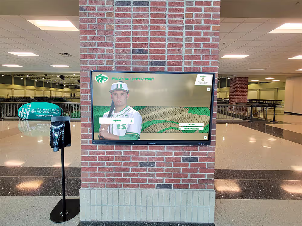
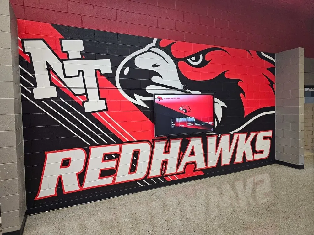
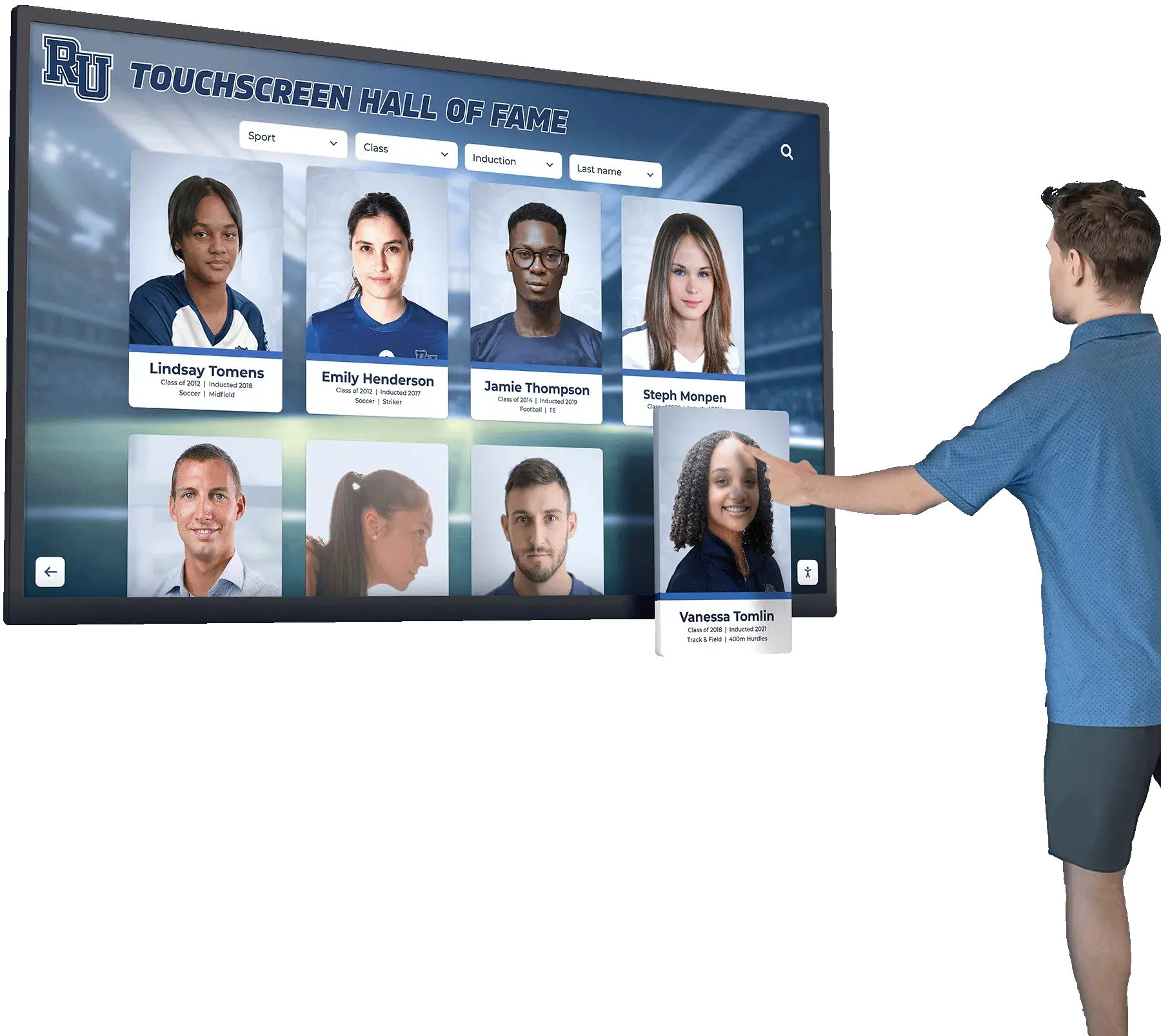
Interactive displays designed with accessibility principles ensure all visitors can explore achievements and institutional history through touch, keyboard, or assistive technology navigation
Level A Success Criteria: Foundation Requirements
Level A criteria establish baseline accessibility that prevents complete content exclusion. Every accessible digital platform must meet all Level A requirements before addressing higher-level criteria.
Perceivable Content Requirements
1.1.1 Non-text Content (Level A)
All images, graphics, charts, icons, and visual elements must include text alternatives describing their content or function. Screen readers convert these text alternatives to speech, enabling blind and low-vision users to understand visual information.
For informative images, alternative text should convey the same information as the image. For functional images like buttons or links, alternative text should describe the action rather than the visual appearance. Decorative images that convey no information should include empty alternative text (alt="") so screen readers skip them.
This criterion represents the most basic accessibility requirement—without text alternatives, blind users encounter meaningless labels like “image287.jpg” rather than understanding what images communicate.
1.2.1 Audio-only and Video-only (Prerecorded) (Level A)
Content presented as audio only (like podcasts) or video only (silent animations) must provide equivalent information through alternative formats. Audio-only content requires text transcripts providing all spoken information. Video-only content requires text descriptions or audio tracks describing visual content.
These alternatives ensure that users who cannot hear audio or see video can still access the information these media convey. Schools posting graduation ceremony videos must provide transcripts of speeches and descriptions of visual ceremonies.
1.2.2 Captions (Prerecorded) (Level A)
All prerecorded video content with audio must include synchronized captions displaying spoken dialogue, sound effects, and other relevant audio information. Captions benefit deaf and hard-of-hearing users, students watching videos in sound-sensitive environments, non-native speakers learning language, and anyone who prefers reading along with audio.
Captions must synchronize accurately with audio, identify speakers when multiple people speak, and include relevant non-speech sounds (like [applause] or [music playing]). Auto-generated captions often contain significant errors and must be reviewed and corrected before publication.
1.2.3 Audio Description or Media Alternative (Prerecorded) (Level A)
Video content must provide audio descriptions narrating visual information not conveyed through the main audio track, or provide complete text transcripts describing both audio and visual information.
Audio descriptions fill pauses in dialogue to describe actions, settings, expressions, and other visual elements that blind users cannot perceive. When video tracks already describe all relevant visual information through dialogue or narration, additional audio description may not be necessary.
1.3.1 Info and Relationships (Level A)
Information, structure, and relationships conveyed visually or through presentation must also be programmatically determinable or available in text. This means using proper HTML semantic elements—headings, lists, tables, form labels—rather than just visual formatting.
Screen readers rely on semantic HTML to communicate document structure. When developers use paragraph tags styled to look like headings instead of actual heading elements, screen reader users cannot navigate efficiently by heading structure, dramatically reducing usability.
1.3.2 Meaningful Sequence (Level A)
Content must present in a logical, meaningful sequence when linearized. When CSS positioning or layout techniques reorder visual presentation, the underlying HTML source order must still make sense when read sequentially.
Screen readers, refreshable braille displays, and simplified mobile views often present content in source order. Content that makes sense visually but presents illogically when linearized creates confusion and prevents users from understanding relationships between elements.
1.3.3 Sensory Characteristics (Level A)
Instructions must not rely solely on sensory characteristics like shape, size, visual location, orientation, or sound. Phrases like “click the round button on the right” or “when you hear the tone” fail for users who cannot perceive the referenced characteristic.
Better instructions incorporate multiple characteristics: “click the Save button (round, blue, located in the upper right)” or provide text labels that assistive technology can identify regardless of visual presentation.
1.4.1 Use of Color (Level A)
Color cannot be the only visual means of conveying information, indicating action, prompting response, or distinguishing elements. This protects users with color blindness, low vision, or monochrome displays.
For example, form errors should not rely solely on turning fields red—they should also include error icons and text messages identifying problems. Required form fields should not use only color to indicate their status—they should also include asterisks, labels, or other indicators.
1.4.2 Audio Control (Level A)
If audio plays automatically for more than three seconds, users must have controls to pause or stop the audio, or adjust volume independently from overall system volume. Automatic audio interferes with screen readers, distracts users with cognitive disabilities, and creates accessibility barriers in shared or public environments.
Educational content should generally avoid automatic audio entirely, letting users choose when to play media.

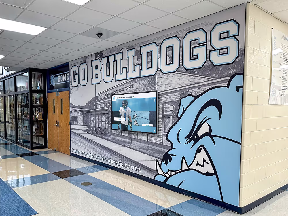
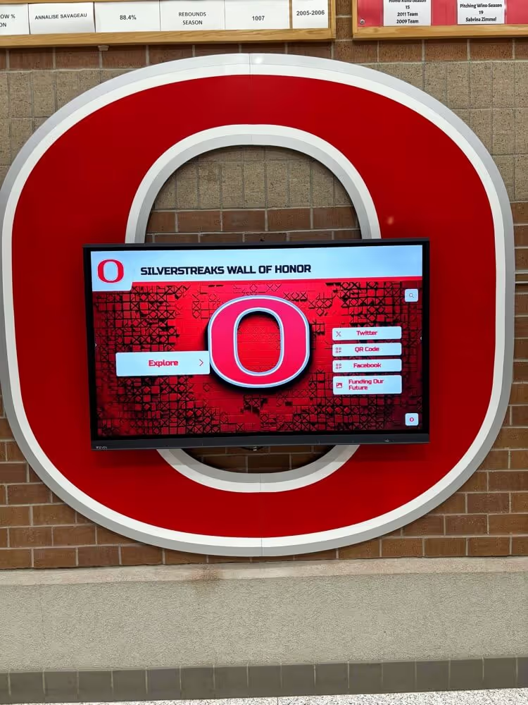
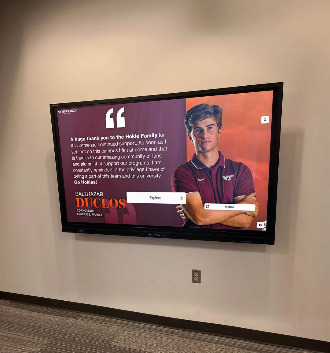
Well-designed recognition displays integrate accessible navigation, clear visual hierarchies, and semantic structure enabling all users to explore achievements effectively
Operable Interface Requirements
2.1.1 Keyboard (Level A)
All functionality must be operable through keyboard interface without requiring specific timing for individual keystrokes. Users who cannot use mice due to motor disabilities, vision loss, or preference must accomplish all tasks using only keyboard controls.
This includes navigating links and buttons, activating controls, submitting forms, controlling media players, dismissing modals, and accessing all interactive elements. Custom interactive components must implement keyboard support matching standard controls.
2.1.2 No Keyboard Trap (Level A)
Focus must never become trapped in a component or page section where users cannot navigate away using only keyboard. Modal dialogs, embedded players, or custom widgets must always provide keyboard-accessible methods to exit.
Keyboard traps represent critical failures that can completely prevent keyboard users from accessing content or completing tasks. Testing must verify that Tab, Shift+Tab, and Escape keys provide escape routes from all interactive components.
2.1.4 Character Key Shortcuts (Level A)
If content implements single-character keyboard shortcuts (like pressing “S” to search), users must be able to turn shortcuts off, remap them to multi-character shortcuts, or have shortcuts active only when specific components have focus.
Single-character shortcuts conflict with speech input software where users’ spoken words can accidentally trigger shortcuts, and can interfere with screen reader commands or custom user key mappings.
2.2.1 Timing Adjustable (Level A)
If content includes time limits, users must be able to turn off, adjust, or extend time limits before encountering them. This protects users who need more time to read, users with cognitive disabilities, users operating assistive technology, and anyone who needs time to complete tasks without artificial pressure.
Common timing issues include session timeouts, timed tests, rotating carousels, and auto-forwarding forms. Solutions include eliminating time limits where possible, providing controls to extend limits before expiration, or warning users well in advance with extension options.
2.2.2 Pause, Stop, Hide (Level A)
Moving, blinking, scrolling, or auto-updating content that starts automatically, lasts more than five seconds, and appears alongside other content must provide controls to pause, stop, or hide it.
Animated content distracts users with attention disorders, cognitive disabilities, or photosensitivity. Users must be able to pause distractions to focus on primary content and tasks.
2.3.1 Three Flashes or Below Threshold (Level A)
Content must not contain elements that flash more than three times per second, or flashing must remain below general flash and red flash thresholds. Flashing content can trigger seizures in users with photosensitive epilepsy.
This represents a safety requirement—violating flash thresholds can cause serious physical harm. Content creators should generally avoid flashing content entirely unless absolutely necessary and properly tested against thresholds.
2.4.1 Bypass Blocks (Level A)
Mechanisms must exist to bypass blocks of content that repeat on multiple pages, like navigation menus, headers, or sidebars. This enables keyboard and screen reader users to skip directly to main content without tabbing through dozens of links on every page.
The most common implementation uses “skip to main content” links as the first focusable element on pages, jumping focus directly to primary content. Proper heading structure also enables screen reader users to navigate efficiently by heading levels.
2.4.2 Page Titled (Level A)
Web pages must have descriptive, unique titles identifying page topics or purposes. Page titles appear in browser tabs, bookmarks, search results, and screen reader announcements, helping users identify and navigate between pages.
Effective titles put unique, identifying information first: “Student Achievement Awards - Central High School” rather than “Central High School - Student Achievement Awards.” This helps users scanning many browser tabs identify specific pages quickly.
2.4.3 Focus Order (Level A)
When users navigate sequentially through pages using keyboards, focus order must follow sequences that preserve meaning and operability. Focus order should generally follow visual reading order unless specific design requirements dictate alternatives.
Illogical focus order confuses users and makes tasks difficult or impossible to complete. Testing must verify that Tab order moves through interactive elements in sensible sequences matching user expectations.
2.4.4 Link Purpose (In Context) (Level A)
The purpose of each link must be determinable from link text alone or from link text together with programmatically determined link context. Users must understand what happens when activating links before clicking or following them.
Avoid generic link text like “click here” or “learn more” without context. Better link text incorporates the destination or action: “download graduation program PDF” or “read more about scholarship requirements.”
Schools implementing alumni engagement platforms must ensure navigation and link structures meet these fundamental requirements.
Touch and Pointer Operation Requirements
2.5.1 Pointer Gestures (Level A)
All functionality that uses multipoint or path-based gestures must also be operable with single-pointer actions without path-based gestures, unless multipoint or path-based gestures are essential.
This protects users with motor disabilities who cannot perform complex gestures like pinch-to-zoom, multi-finger swipes, or drawing specific patterns. Alternatives should use simpler single-tap or click actions.
2.5.2 Pointer Cancellation (Level A)
For functionality operated using single pointers, at least one of the following must be true: actions do not execute on the down-event, actions complete on the up-event with ability to abort, up-event reverses down-event completion, or completing action on down-event is essential.
This gives users opportunities to change their minds or recover from accidental activations by moving pointers away from controls before releasing, preventing errors from accidental touches or clicks.
2.5.3 Label in Name (Level A)
For user interface components with labels that include text or images of text, the accessible name must contain the text presented visually. This ensures that speech input users can activate controls by speaking their visible labels.
When visible labels say “Search” but accessible names say “Submit Query,” speech input users who say “click Search” find that nothing happens because the control’s programmatic name doesn’t match the visual label.
2.5.4 Motion Actuation (Level A)
Functionality triggered by device motion or user motion must also be operable through user interface components, and ability to disable motion actuation must be available.
Some users cannot perform motion gestures like shaking devices or tilting screens. Others experience unintentional motion triggers from tremors or device placement. Alternative operation methods and disable options ensure accessibility.

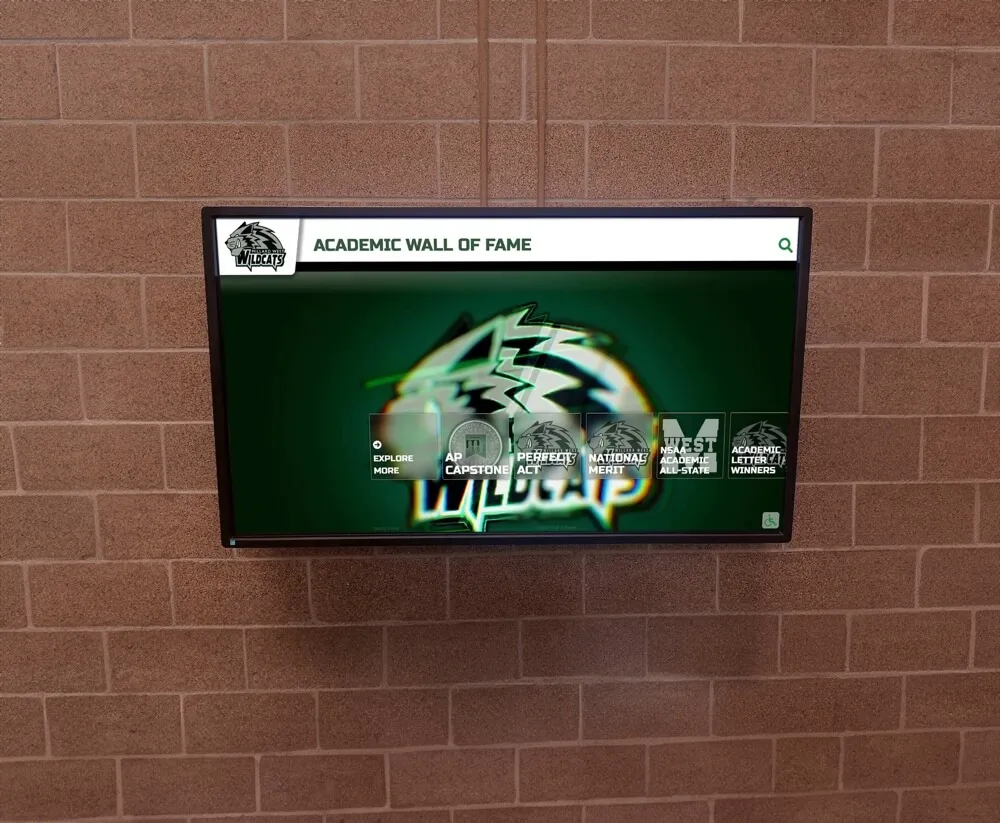
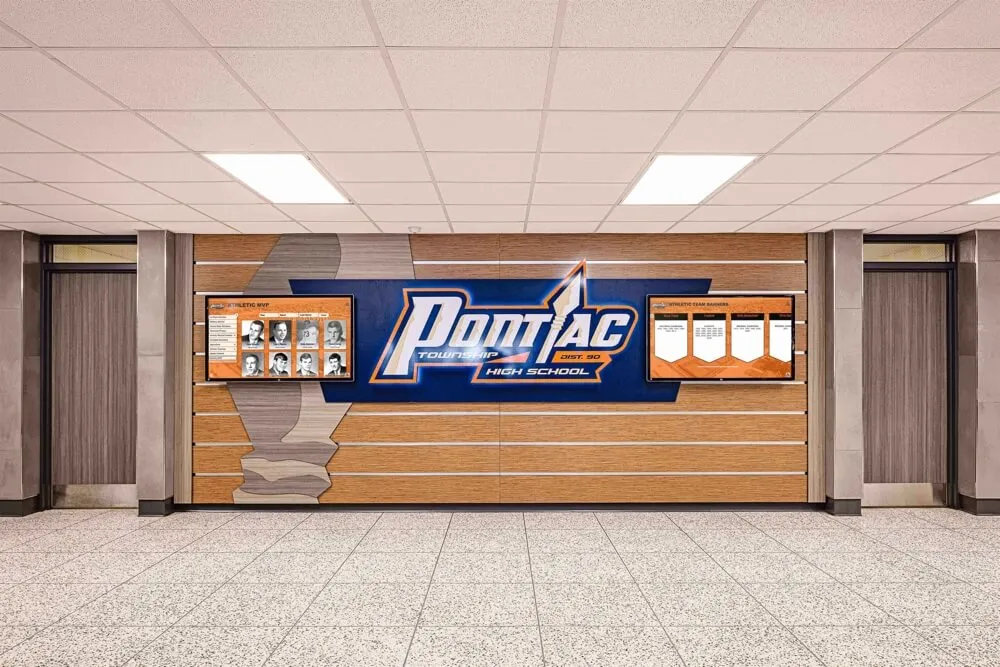
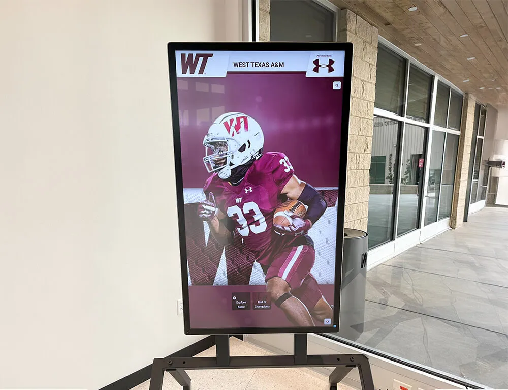
Accessible platforms must function across all devices and input methods, ensuring content remains usable whether accessed through desktop computers, tablets, smartphones, or assistive technologies
Understandable and Robust Content
3.1.1 Language of Page (Level A)
The default human language of each page must be programmatically determinable through lang attributes in HTML. This enables screen readers, translation tools, and browsers to process content using appropriate languages and pronunciation rules.
Without language declarations, screen readers apply default language settings, often producing incomprehensible pronunciations when actual content uses different languages.
3.2.1 On Focus (Level A)
When any user interface component receives focus, it must not initiate context changes automatically. Focus should never trigger actions like submitting forms, opening new windows, changing page content, or moving focus elsewhere.
Automatic context changes confuse screen reader users who may not realize pages have changed and disorient keyboard users whose focus position suddenly shifts unexpectedly.
3.2.2 On Input (Level A)
Changing settings on user interface components must not automatically cause context changes unless users have been advised before using the component. Simply selecting radio buttons, checking boxes, or changing form values should not automatically submit forms or navigate to new pages.
Users need opportunities to review entries and make corrections before submission. Automatic form submission removes this control and creates accessibility barriers.
3.2.6 Consistent Help (Level A 2.2 only)
When help mechanisms like contact information, help desks, or automated contact forms appear on multiple pages, they must appear in consistent relative order across those pages unless users initiate changes.
Consistent help location enables users to develop mental models of where to find assistance, reducing cognitive load and making help more discoverable.
3.3.1 Error Identification (Level A)
If input errors are detected automatically, items in error must be identified and described to users in text. Visual indicators alone (like red borders) do not satisfy this requirement—text descriptions must communicate what went wrong.
Error messages should identify which fields have errors and explain specifically what problems were detected: “Email address is required” or “Phone number must include area code.”
3.3.2 Labels or Instructions (Level A)
Labels or instructions must be provided when content requires user input. Users cannot complete forms or input tasks effectively without understanding what information is required or what format is expected.
Clear labels identify form fields, instructions explain formatting requirements or provide examples, and required field indicators communicate which fields must be completed before submission.
3.3.7 Redundant Entry (Level A 2.2 only)
Information required to be entered more than once in a single process must either auto-populate from previous entries, be available for selection from previous entries, or be essential for security, validation, or functionality.
Requiring redundant data entry increases errors, creates frustration, and particularly burdens users with cognitive or motor disabilities. Processes should remember information across steps rather than requiring re-entry.
4.1.2 Name, Role, Value (Level A)
For all user interface components, name and role must be programmatically determinable, states and properties must be programmatically set, and notification of changes must be available to user agents including assistive technologies.
This ensures that screen readers and other assistive technologies can identify controls, understand their purposes, communicate their states (checked, expanded, selected), and notify users when states change.
Custom interactive components must implement appropriate ARIA attributes to expose this information since native HTML elements provide it automatically.
Level AA Success Criteria: Standard Compliance Target
Level AA criteria build on Level A foundations by addressing additional barriers that affect broader populations. Meeting Level AA represents the generally accepted standard for demonstrating good-faith accessibility efforts.
Enhanced Media Requirements
1.2.4 Captions (Live) (Level AA)
Captions must be provided for all live audio content in synchronized media, including webinars, live streams, video conferences, and real-time performances. This ensures deaf and hard-of-hearing users can access time-sensitive live content.
Live captioning typically requires professional caption services (CART - Communication Access Real-time Translation) or trained caption operators, as automated systems often lack sufficient accuracy for real-time captioning.
1.2.5 Audio Description (Prerecorded) (Level AA)
Audio description must be provided for all prerecorded video content in synchronized media. This extends Level A requirements which allowed text transcripts as alternatives—Level AA specifically requires audio description tracks.
Audio descriptions narrate visual information during natural pauses in dialogue, enabling blind and low-vision users to follow visual storytelling, understand settings, recognize characters, and comprehend actions.
Schools producing athletic highlight videos must include audio descriptions explaining plays, player movements, and visual celebrations.
Responsive and Adaptive Design
1.3.4 Orientation (Level AA 2.1 and 2.2)
Content must not restrict view and operation to a single display orientation (portrait or landscape) unless specific orientation is essential. Users must be able to view and operate content in their preferred orientations.
Some users mount devices to wheelchairs in fixed orientations. Others use devices on desks or stands that don’t rotate. Essential exceptions include piano apps requiring landscape for full keyboard display or banking check capture requiring specific orientations.
1.3.5 Identify Input Purpose (Level AA 2.1 and 2.2)
The purpose of input fields collecting user information must be programmatically determinable using HTML autocomplete attributes. This enables browsers and assistive technologies to help users complete forms by auto-filling common fields.
Autocomplete helps users with cognitive disabilities who struggle to remember personal information, users with motor disabilities who find typing difficult, and all users by reducing form completion time and errors.
Visual Design Requirements
1.4.3 Contrast (Minimum) (Level AA)
Text and images of text must have contrast ratios of at least 4.5:1 against backgrounds. Large text (18pt+ regular or 14pt+ bold) requires minimum 3:1 contrast. Incidental text, logos, and inactive controls are exempt.
Low contrast creates reading difficulties for users with low vision, color blindness, or anyone viewing screens in bright environments or on low-quality displays. Contrast requirements ensure readability across diverse viewing conditions.
Testing tools like WebAIM’s Contrast Checker help verify color combinations meet requirements. Dark gray text on light gray backgrounds commonly fails contrast requirements despite appearing readable to designers with good vision.
1.4.4 Resize Text (Level AA)
Text must be resizable up to 200% without loss of content or functionality, except for captions and images of text. Users must be able to zoom text without horizontal scrolling, disappearing content, or overlapping elements.
Many users increase text size to compensate for vision loss, small screens, or viewing distances. Designs must accommodate text zoom through flexible layouts, relative sizing, and proper testing at 200% scale.
1.4.5 Images of Text (Level AA)
Images of text should be avoided except when text presentation is essential to the information being conveyed, or text images can be visually customized to user requirements.
Real text provides better readability, scales cleanly at any size, works with user stylesheets and dark modes, and enables text selection and translation. Images of text lose these benefits while creating larger file sizes.
1.4.10 Reflow (Level AA 2.1 and 2.2)
Content must reflow without requiring scrolling in two dimensions at 320 CSS pixel width, except for parts requiring two-dimensional layout for usage or meaning.
This ensures mobile users, desktop zoom users, and anyone with low vision can read content by scrolling in one direction only. Two-dimensional scrolling (both horizontal and vertical) creates significant usability barriers.
1.4.11 Non-text Contrast (Level AA 2.1 and 2.2)
User interface components and graphical objects must have 3:1 contrast against adjacent colors. This applies to form controls, buttons, icons, focus indicators, and meaningful graphics.
Users with low vision need sufficient contrast to perceive control boundaries, distinguish clickable elements, and identify interface components. Subtle gray buttons on light backgrounds often fail this requirement.
1.4.12 Text Spacing (Level AA 2.1 and 2.2)
Content must not lose information or functionality when users override text spacing with specific parameters: line height to 1.5x font size, paragraph spacing to 2x font size, letter spacing to 0.12x font size, and word spacing to 0.16x font size.
Users with dyslexia or low vision may customize text spacing to improve readability. Designs with fixed heights, insufficient padding, or absolute positioning may clip content when users apply custom spacing.
1.4.13 Content on Hover or Focus (Level AA 2.1 and 2.2)
Additional content triggered by hover or focus (like tooltips or dropdown menus) must be dismissible without moving pointer or focus, hoverable so users can move pointers over new content without it disappearing, and persistent so content remains visible until users dismiss it or remove trigger.
These requirements support users with low vision who need to examine triggered content closely, users with pointer tremors who accidentally trigger content, and screen magnification users whose viewports may not show both triggers and triggered content simultaneously.

Touch interfaces must support multiple interaction methods and provide alternatives for users who cannot perform complex gestures, ensuring equitable access for all abilities
Enhanced Navigation Requirements
2.4.5 Multiple Ways (Level AA)
More than one way must be provided to locate pages within sets of pages, except where pages represent steps in processes. Common solutions include site maps, search functions, tables of contents, or navigation menus.
Multiple navigation methods help different users find content through their preferred approaches—some browse hierarchies, others search by keyword, some use tables of contents. Multiple methods ensure all users can locate information.
2.4.6 Headings and Labels (Level AA)
Headings and labels must be descriptive, clearly indicating topics or purposes. Generic headings like “Introduction” or “More Information” provide less value than specific headings describing actual content.
Descriptive headings help all users scan content, enable screen reader users to navigate by heading structure, and support users with cognitive disabilities who benefit from clear content organization.
2.4.7 Focus Visible (Level AA)
When user interface components receive keyboard focus, visual focus indicators must be visible. Users must be able to see which element currently has focus as they navigate using keyboards.
Many modern designs remove default browser focus indicators for aesthetic reasons without implementing custom indicators, creating critical barriers for keyboard users who cannot determine focus location.
2.4.11 Focus Not Obscured (Minimum) (Level AA 2.2 only)
When user interface components receive focus, at least part of the focused component must not be entirely hidden by author-created content. Sticky headers, footers, or other fixed-position elements must not completely cover focused elements.
Users navigating by keyboard need to see focused elements to understand context and available actions. Partially obscured focus states are acceptable at Level AA (Level AAA requires no obscuring).
2.5.7 Dragging Movements (Level AA 2.2 only)
All functionality requiring dragging movements must also be operable with single pointer actions without dragging, unless dragging is essential or user agent-determined.
Users with motor disabilities often cannot perform precise dragging actions. Alternatives might include buttons to move items, keyboard controls, or tap-to-select then tap-destination approaches.
2.5.8 Target Size (Minimum) (Level AA 2.2 only)
Interactive targets must be at least 24 by 24 CSS pixels, except when equivalent targets exist, inline targets appear in sentences or blocks of text, target size is user agent determined, or particular presentation is essential.
Small touch targets create errors for users with motor control challenges, older adults, anyone using touchscreens, and users in motion or holding devices single-handed. Generous touch target spacing prevents accidental activation of adjacent controls.
Institutions implementing interactive digital displays must ensure touch targets meet minimum size requirements for comfortable, accurate interaction.
Consistent Navigation and Identification
3.1.2 Language of Parts (Level AA)
The human language of each passage or phrase in content must be programmatically determinable, except for proper names, technical terms, words of indeterminate language, or words that have become part of the vernacular.
When pages include content in multiple languages, appropriate lang attributes enable screen readers to switch pronunciation rules, ensuring accurate reading of multilingual content.
3.2.3 Consistent Navigation (Level AA)
Navigation mechanisms repeated on multiple pages must occur in consistent relative order each time they repeat, unless users initiate changes. Consistent navigation helps users develop mental models of site structure and locate navigation elements efficiently.
Changing navigation order between pages forces users to relearn locations, creating confusion and inefficiency particularly for users with cognitive disabilities who rely heavily on consistent patterns.
3.2.4 Consistent Identification (Level AA)
Components with the same functionality must be identified consistently across sets of pages. Search buttons should use the same labels and icons throughout sites, not “Search” on one page, “Find” on another, and “Go” on a third.
Consistent identification enables users to recognize familiar patterns, reducing cognitive load and making interfaces more predictable and learnable.
Enhanced Input Assistance
3.3.3 Error Suggestion (Level AA)
If input errors are detected automatically and suggestions for correction are known, suggestions must be provided unless doing so would jeopardize security or purpose.
Generic error messages like “Invalid input” provide less help than specific suggestions: “Phone number must include area code. Example: 555-123-4567.” Constructive suggestions help all users correct errors efficiently.
3.3.4 Error Prevention (Legal, Financial, Data) (Level AA)
For pages causing legal commitments, financial transactions, data deletion, or test response submission, at least one of the following must be true: submissions are reversible, data is checked and users have opportunities to correct errors, or confirmation mechanisms review and correct information before finalizing submissions.
High-stakes transactions require safeguards preventing costly or irreversible errors. Users must have opportunities to review and correct information before finalizing consequential actions.
Schools processing donor contributions or registration payments must implement confirmation workflows meeting these requirements.
3.3.8 Accessible Authentication (Minimum) (Level AA 2.2 only)
Cognitive function tests must not be required for any authentication step unless the test provides mechanisms assisting users, involves recognizing objects, or involves identifying non-text content provided by users to the website.
Traditional CAPTCHA systems requiring users to decipher distorted text or solve puzzles create barriers for users with cognitive disabilities. Alternative authentication methods include recognizing previously uploaded images, single sign-on, password managers, or email/SMS verification codes.
4.1.3 Status Messages (Level AA 2.1 and 2.2)
Status messages must be programmatically determinable through roles or properties enabling presentation by assistive technologies without receiving focus. This includes confirmation messages (“form submitted successfully”), progress indicators (“loading…”), and alerts (“error processing request”).
Screen reader users need notifications of status changes, search results, shopping cart updates, and error messages without those announcements requiring focus changes that interrupt workflow.
Level AAA Success Criteria: Excellence and Specialized Needs
Level AAA represents the highest conformance level, including stringent requirements that may not be achievable for all content. Organizations typically target specific Level AAA criteria rather than comprehensive Level AAA compliance.
Enhanced Media and Language Support
1.2.6 Sign Language (Prerecorded) (Level AAA)
Sign language interpretation must be provided for all prerecorded audio content in synchronized media. While captions help deaf and hard-of-hearing users, American Sign Language (ASL) is the primary language for many deaf individuals, making sign language interpretation more accessible than written captions.
1.2.7 Extended Audio Description (Prerecorded) (Level AAA)
When pauses in foreground audio are insufficient for audio descriptions to convey visual information, extended audio description must be provided. This means pausing video to provide complete descriptions when continuous dialogue prevents adequate description insertion.
1.2.8 Media Alternative (Prerecorded) (Level AAA)
Alternative for time-based media (full text transcripts) must be provided for all prerecorded synchronized media and prerecorded video-only media. These comprehensive transcripts provide searchable, translatable alternatives to audio-video content.
1.2.9 Audio-only (Live) (Level AAA)
Alternative for time-based media that presents equivalent information for live audio-only content must be provided. Live audio broadcasts should include real-time text transcripts enabling deaf and hard-of-hearing users to follow content.
1.3.6 Identify Purpose (Level AAA 2.1 and 2.2)
The purpose of user interface components, icons, and regions must be programmatically determinable in content implemented using markup languages. This enables personalization tools to replace complex interfaces with simplified, customized alternatives matching individual user needs.
Stringent Visual Requirements
1.4.6 Contrast (Enhanced) (Level AAA)
Text and images of text must have contrast ratios of at least 7:1, with large text requiring at least 4.5:1 contrast. These enhanced ratios provide even better readability for users with low vision or color deficiencies.
1.4.7 Low or No Background Audio (Level AAA)
For prerecorded audio-only content that primarily contains speech, background sounds must be at least 20 dB lower than speech (with exceptions for brief sounds), or no background sound must be present. This ensures clarity for users with hearing impairments who struggle to distinguish speech from background noise.
1.4.8 Visual Presentation (Level AAA)
For blocks of text, users must be able to achieve foreground and background color selection, width no more than 80 characters, text justification avoidance, line spacing at least 1.5 in paragraphs, paragraph spacing at least 2x line spacing, text resizable to 200% without horizontal scrolling, and color specification for text backgrounds.
These requirements support users who need custom visual presentations to read comfortably, including users with dyslexia who benefit from specific spacing and width parameters.
1.4.9 Images of Text (No Exception) (Level AAA)
Images of text must be used only for pure decoration or where text presentation is essential. This stronger prohibition than Level AA further emphasizes real text advantages.
Comprehensive Keyboard and Interaction Support
2.1.3 Keyboard (No Exception) (Level AAA)
All functionality must be operable through keyboard interface without requiring specific timing, with no exceptions. This removes Level A exceptions that allowed alternate methods.
2.2.3 No Timing (Level AAA)
Timing must not be an essential part of events or activities except for non-interactive synchronized media and real-time events. This protects users who need unlimited time to complete tasks.
2.2.4 Interruptions (Level AAA)
Interruptions can be postponed or suppressed by users except interruptions involving emergencies. Pop-ups, alerts, and automatic updates should not interrupt workflow unless users opt in or emergencies warrant interruption.
2.2.5 Re-authenticating (Level AAA)
When authenticated sessions expire, users must be able to continue activity without data loss after re-authenticating. Session timeouts should save form data so users don’t lose work while away from computers.
2.2.6 Timeouts (Level AAA 2.1 and 2.2)
Users must be warned of data loss due to inactivity unless data is preserved for 20 hours or more. This prevents unexpected data loss from session expirations.
2.3.2 Three Flashes (Level AAA)
Web pages must not contain anything that flashes more than three times in any one-second period. This more restrictive requirement removes Level A exceptions.
2.3.3 Animation from Interactions (Level AAA 2.1 and 2.2)
Motion animation triggered by interaction can be disabled unless the animation is essential. This protects users with vestibular disorders who experience dizziness, nausea, or headaches from motion animations.
Navigation and Layout Excellence
2.4.8 Location (Level AAA)
Information about user location within sets of pages must be available. Breadcrumb navigation, site maps with current page indication, and clear section indicators help users understand where they are within site hierarchies.
2.4.9 Link Purpose (Link Only) (Level AAA)
Mechanisms must allow link purposes to be identified from link text alone, except where link purpose would be ambiguous to users generally. This stronger requirement than Level A means links must be completely self-describing without relying on surrounding context.
2.4.10 Section Headings (Level AAA)
Section headings must be used to organize content. Proper heading structure benefits all users by creating scannable content and enabling efficient navigation.
2.4.12 Focus Not Obscured (Enhanced) (Level AAA 2.2 only)
When user interface components receive focus, no part of the focused component is hidden by author-created content. This requires complete visibility rather than Level AA’s partial visibility.
2.4.13 Focus Appearance (Level AAA 2.2 only)
When user interface components have keyboard focus, the focus indicator area must be at least as large as 2 CSS pixel perimeter of unfocused component, have contrast ratio of 3:1 between focused and unfocused states, and not be entirely hidden by other content.
2.5.5 Target Size (Level AAA 2.1 and 2.2)
Interactive targets must be at least 44 by 44 CSS pixels, with exceptions similar to Level AA but requiring larger minimum sizes. This provides more generous spacing for users with motor control challenges.
2.5.6 Concurrent Input Mechanisms (Level AAA 2.1 and 2.2)
Content must not restrict use of input modalities available on platforms unless restriction is essential, required for security, or necessary to respect user settings. Users should be able to switch between touch, keyboard, mouse, and voice input freely.

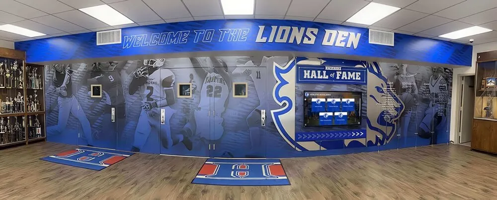
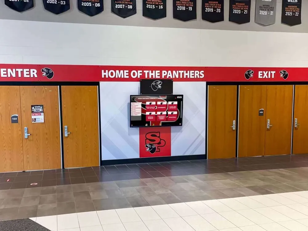
Accessible displays serve all community members by implementing comprehensive keyboard navigation, clear visual hierarchies, and semantic structure enabling independent exploration
Enhanced Comprehension Support
3.1.3 Unusual Words (Level AAA)
Mechanisms must be available for identifying specific definitions of words or phrases used in unusual or restricted ways, including idioms and jargon. Glossaries, inline definitions, or linked definitions help users understand specialized terminology.
3.1.4 Abbreviations (Level AAA)
Mechanisms must identify expanded forms or meanings of abbreviations. This helps users encountering unfamiliar acronyms or abbreviations that may have multiple meanings depending on context.
3.1.5 Reading Level (Level AAA)
When text requires reading ability more advanced than lower secondary education level after removing proper names and titles, supplemental content or versions not requiring advanced reading ability must be available.
Complex technical or academic content may not meet this criterion, but organizations should simplify text where possible and provide plain language alternatives when serving general audiences.
3.1.6 Pronunciation (Level AAA)
Mechanisms must identify specific pronunciations of words where meaning is ambiguous without knowing pronunciation. This helps users with cognitive disabilities or language learners understand homographs like “read” (present) vs “read” (past).
3.2.5 Change on Request (Level AAA)
Changes of context must be initiated only by user request or mechanisms to turn off such changes must be available. No automatic redirects, refreshes, or pop-ups should occur without user control.
Advanced Input Support
3.3.5 Help (Level AAA)
Context-sensitive help must be available. Users should access help information relevant to their current tasks and screens without searching through general help systems.
3.3.6 Error Prevention (All) (Level AAA)
For pages requiring user information submission, at least one of the following must be true: submissions are reversible, data is checked and users correct errors, or confirmation reviews information. This extends Level AA requirements to all submissions rather than only high-stakes transactions.
3.3.9 Accessible Authentication (Enhanced) (Level AAA 2.2 only)
Cognitive function tests must not be required for any authentication step unless alternatives assist users or tests involve object or user content recognition. This strengthens Level AA by removing more cognitive barriers.
Implementing WCAG 2.2 AA for Educational Platforms
Schools implementing digital yearbooks, interactive displays, and online platforms must integrate accessibility from initial design through ongoing content management.
Start with Accessible Foundations
Choose Accessible Platforms
Select content management systems, digital display software, and web platforms with accessibility built in rather than retrofitting accessibility onto inaccessible systems. Platforms like Rocket Alumni Solutions implement WCAG 2.2 AA compliance in core architecture rather than requiring schools to manually ensure accessibility for every piece of content.
Use Semantic HTML
Proper HTML structure provides the foundation for accessibility. Use heading elements (h1-h6) in logical hierarchies, list elements (ul, ol) for lists, button elements for buttons, native form controls with proper labels, and landmark elements (nav, main, aside) defining page regions.
Implement Keyboard Navigation
Ensure all interactive elements can be reached and operated using only keyboards. Test by unplugging mice and navigating entire sites using Tab, Shift+Tab, Enter, and arrow keys. All functionality accessible by mouse must also be accessible by keyboard.
Provide Text Alternatives
Write descriptive alternative text for all informative images. Use empty alt attributes (alt="") for decorative images. Provide captions for videos and transcripts for audio content. Never leave alt attributes blank or omit them entirely.
Design with Accessibility Principles
Ensure Sufficient Color Contrast
Test color combinations using contrast checkers before implementing designs. Aim for 7:1 contrast for body text when possible (exceeding Level AA requirements) and ensure all text meets minimum 4.5:1 ratios. Use patterns or textures in addition to color to convey information.
Design Flexible Layouts
Build responsive designs that accommodate browser zoom, custom text spacing, and different viewport sizes. Avoid fixed heights and widths that cause content to clip or overflow. Test layouts at 200% zoom across multiple screen sizes.
Create Clear Focus Indicators
Design visible focus indicators for all interactive elements. Default browser focus outlines often provide good visibility—if removing them, implement custom focus styles with sufficient contrast and size. Test focus visibility across different backgrounds and contexts.
Size Interactive Elements Generously
Make buttons, links, and form controls at least 24x24 CSS pixels (Level AA) and ideally 44x44 pixels (Level AAA). Provide adequate spacing between interactive elements to prevent accidental activation of adjacent controls.
Produce Accessible Content
Write Descriptive Headings
Create heading hierarchies that outline content structure. Use h1 for page titles, h2 for major sections, h3 for subsections. Make headings descriptive rather than generic—“Scholarship Application Requirements” rather than just “Requirements.”
Write Clear Instructions
Provide explicit form instructions explaining required fields, acceptable formats, and validation requirements. Use required attributes and aria-required for screen reader announcement. Indicate required fields with asterisks plus text explanations, not asterisks alone.
Create Meaningful Link Text
Write link text that makes sense out of context. Screen reader users often navigate by links list, hearing only link text without surrounding context. “Download 2026 graduation program PDF (1.2 MB)” works better than “click here.”
Caption and Describe Media
Add accurate synchronized captions to all videos. Provide audio descriptions narrating visual information. Create comprehensive transcripts that include both audio dialogue and visual descriptions. Budget for professional captioning rather than relying solely on auto-generated captions.
Educational institutions creating athletic recognition displays must ensure these platforms meet comprehensive accessibility requirements.
Test with Real Users and Assistive Technologies
Conduct Keyboard Testing
Navigate sites using only keyboards, ensuring all functionality is accessible without mice. Verify logical tab order, visible focus indicators throughout, and no keyboard traps that prevent escape from components.
Test with Screen Readers
Use NVDA (free, Windows), JAWS (commercial, Windows), VoiceOver (built-in, macOS/iOS), or TalkBack (built-in, Android) to experience sites as blind users do. Verify that all information and functionality is announced clearly and navigation makes sense without visual context.
Test with Browser Zoom
Zoom browsers to 200% and verify content remains readable without horizontal scrolling, elements don’t overlap, and functionality remains intact. Test custom text spacing by installing browser extensions that override default spacing.
Test Color and Contrast
Use browser extensions simulating color blindness to verify information conveyed through color remains distinguishable. Use contrast analyzers to verify all text and interface elements meet minimum contrast requirements.
Include Users with Disabilities
The most valuable accessibility testing involves real users with disabilities navigating your platforms with their preferred assistive technologies and strategies. Consider hiring accessibility consultants who are themselves disabled or partnering with disability advocacy organizations for usability testing.
Build Accessible Digital Experiences for Your School Community
Discover how purpose-built platforms implement WCAG 2.2 AA compliance through accessible architecture, semantic code, keyboard navigation, screen reader support, and comprehensive testing—ensuring your digital yearbooks, recognition displays, and interactive content serve all community members equitably without requiring manual accessibility expertise for every piece of content.
Talk to our team to explore accessible digital solutions designed specifically for educational institutions committed to inclusive experiences that honor every student, family member, and community participant regardless of ability.
The Imperative of Accessible Digital Experiences
Web accessibility represents both legal compliance and moral commitment to inclusive communities where all members can participate fully regardless of ability. For educational institutions, this commitment extends beyond avoiding lawsuits—it reflects fundamental values about equity, inclusion, and ensuring every student sees themselves represented and celebrated.
WCAG 2.2 Level AA compliance provides comprehensive technical standards for building accessible digital experiences. While these requirements may initially seem overwhelming, many become natural parts of quality design and development when integrated from project inception rather than retrofitted onto inaccessible platforms.
Schools implementing digital yearbooks, interactive recognition displays, and online platforms should prioritize accessibility alongside functionality, visual design, and user experience. Accessible platforms serve larger audiences more effectively while protecting institutions from legal risks and reputational damage.
Modern platforms like Rocket Alumni Solutions build accessibility into core architecture, ensuring schools meet WCAG 2.2 AA requirements without requiring technical accessibility expertise from administrators, teachers, or student staff. This architecture enables schools to focus on content and community engagement while trusting that platforms serve all users equitably.
Accessibility benefits everyone—keyboard shortcuts help power users, captions assist language learners and users in sound-sensitive environments, clear navigation aids users with cognitive differences and anyone feeling overwhelmed by complex interfaces, and high contrast improves readability for all users in bright environments or on low-quality displays.
By committing to WCAG 2.2 Level AA compliance, schools demonstrate that every community member matters, every story deserves telling, and every achievement warrants celebration—regardless of how individuals access digital content or what assistive technologies they use to navigate online spaces. This commitment transforms accessibility from compliance checkbox into values statement about who belongs and who gets included in institutional memory and community celebration.
Ready to implement accessible digital platforms for your school? Explore comprehensive solutions that build accessibility into every feature rather than treating it as afterthought or add-on requiring constant vigilance. When platforms implement WCAG 2.2 AA compliance at the architectural level, schools can confidently serve all community members while focusing energy on content, engagement, and celebration of the achievements that make institutions special.