A school logo does more than identify a building—it carries decades of pride, signals belonging to every student who wears it on a jersey, and anchors every yearbook cover, hall-of-fame display, and digital recognition wall the school will ever produce. When designed thoughtfully, a school logo becomes visual shorthand for the institution’s entire culture: its mascot, colors, values, and history converging in a single mark that alumni recognize forty years after graduation.
Yet many schools either inherit outdated logos that no longer reflect their community or create rushed graphics that fall apart at large formats. The result is inconsistent branding across yearbook covers, lobby murals, athletic signage, and digital displays—each surface telling a slightly different visual story. This guide walks through practical school logo design ideas covering logo style options, color strategy, typography systems, and deployment across every surface where your school’s identity needs to show up strong.
Whether you’re building a new visual identity from scratch, refreshing an aging mark, or simply standardizing how your existing logo appears across print and digital environments, the strategies here apply directly to yearbooks, recognition walls, hall-of-fame installations, and the broader campus experience.
Your school logo is the single most-repeated visual element your institution produces. It appears on yearbook covers and spines, athletic uniforms, lobby murals, digital display backgrounds, merchandise, graduation programs, alumni newsletters, and donor recognition walls. Investing in a well-designed, versatile logo pays dividends across every surface, every year.

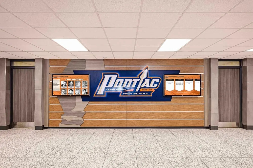
A well-designed school crest anchors lobby murals, digital screens, and recognition displays—creating cohesive branding throughout the building
Why School Logo Design Matters Beyond Athletics
School logos often get treated as athletic department assets—designed once for a uniform, then borrowed everywhere else. That approach creates problems when the same mark needs to appear at banner scale in a gymnasium but was only tested at jersey-patch size, or when the yearbook committee uses a slightly different version than the drama program.
Strong school logo design serves multiple constituencies simultaneously:
- Students need a mark they wear proudly on spirit wear and identify with immediately
- Faculty and staff need professional branding that reflects institutional quality in all communications
- Alumni need a mark that connects their current identity to their formative school years
- Administrators need a versatile asset that works across digital, print, and dimensional applications
When schools invest in intentional visual identity, they see stronger enrollment marketing, more cohesive campus environments, and higher alumni engagement with recognition programs. Creative ways to build school spirit and community consistently point to logo consistency as the foundation of effective wayfinding and community-building across school facilities.
The Five Core School Logo Styles
Understanding which logo style fits your school’s identity is the first design decision—and it shapes every subsequent choice about color, typography, and format flexibility.
1. Mascot-Based Logos
The most common school logo style centers on an illustrated mascot—the eagle, panther, bulldog, or warrior representing your school’s competitive spirit. Done well, a mascot logo conveys energy, pride, and personality in a way no abstract mark can match.
What makes mascot logos work:
- A clear, bold silhouette readable at any scale, from app icons to gymnasium banners
- Consistent line weight that holds detail in embroidery and engraving
- A mascot pose that functions both as a full illustration and a simplified icon version
- Compatibility with your school’s primary color palette
Common pitfalls to avoid:
- Overly complex illustrations that lose detail when reduced to small sizes
- Mascots that feel generic—the same clip-art eagle used by dozens of other schools
- Poses that don’t scale: detailed facial features become invisible on a jersey emblem
Exploring diverse school mascot ideas helps committees move beyond default choices toward marks that genuinely reflect the school’s geographic region, history, and community character.
2. Crest and Shield Logos
Shield and crest logos carry an institutional weight that mascot-only marks often lack. They communicate tradition, academic rigor, and multi-generational history—qualities that resonate with alumni relations programs, college prep identities, and schools with deep founding histories.
Elements of effective crest logos:
- A strong shield shape containing all design elements without appearing crowded
- Division of the shield into quadrants representing distinct school values (academics, athletics, arts, service)
- Incorporation of founding year, Latin motto, or institutional colors as structural design elements
- A simplified version for digital use alongside a detailed version for formal print applications
Crest logos excel on yearbook covers, formal recognition plaques, diploma frames, and donor walls where institutional gravitas matters most.
3. Lettermark and Wordmark Logos
Lettermark logos (stylized initials like “GHS” or “WHS”) and wordmark logos (the school name rendered in custom typography) offer maximum flexibility for digital environments where mascot illustrations lose impact at small sizes.
When lettermarks work best:
- Schools with long names that don’t abbreviate elegantly into mascot-plus-name combinations
- Digital-first applications: website headers, social media profile icons, app icons
- Embossed or engraved applications where illustration complexity adds cost without visual return
Typography considerations for school wordmarks:
- Avoid fonts that date quickly—script fonts popular today may feel dated at a 25-year reunion
- Custom lettering (even subtle modifications to a base font) creates distinctiveness no off-the-shelf font provides
- Serif fonts signal tradition; sans-serif signals modernity; slab serifs bridge both sensibilities
4. Combination Marks
The most versatile school logos are combination marks—pairing a mascot, crest, or monogram with the school name in a lockup that can be used together or split into components for different applications.
A combination mark gives you:
- A primary full lockup for yearbook covers, lobby displays, and official communications
- An isolated mascot for athletic use, merchandise, and digital avatars
- A wordmark for formal contexts like transcripts, diplomas, and donor communications
- A monogram for subtle applications like watermarks, embossing, and fine merchandise
5. Abstract and Icon Logos
Some schools—particularly newer institutions or those undergoing intentional rebranding—choose abstract marks that communicate values through shape and color rather than literal representation. These work best when supported by strong brand guidelines that educate the community about the mark’s meaning and intent.
Abstract logos require more brand education investment but offer distinctive visual identity in competitive spaces where every neighboring school fields a variation of the same common mascot.
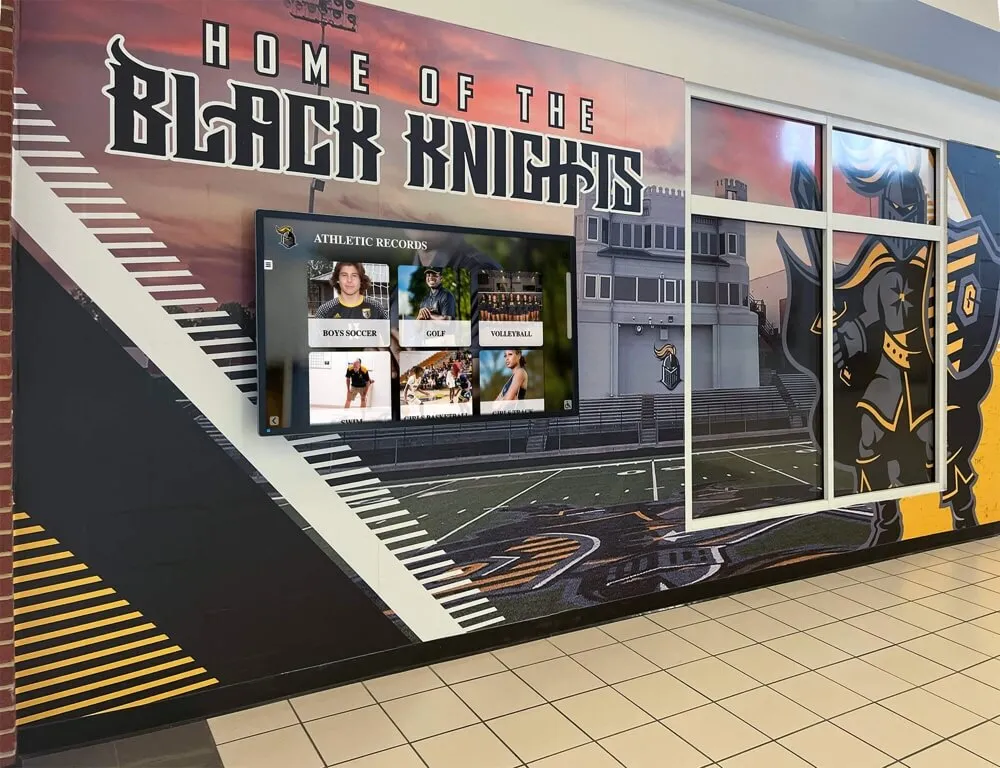
![]()
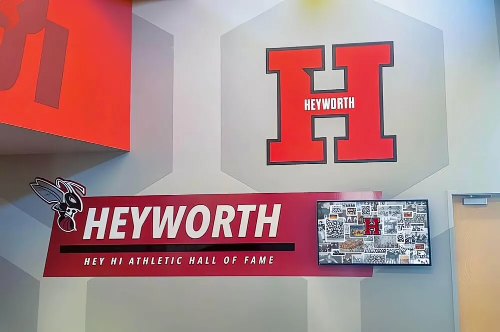
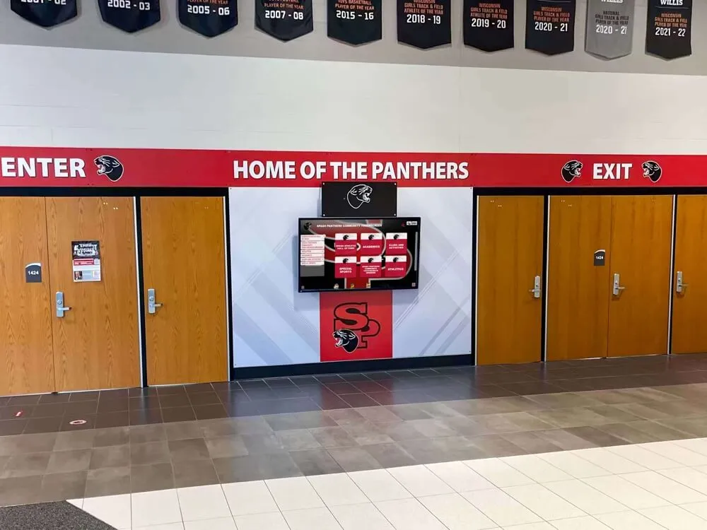
Consistent logo application across athletic honor boards creates a unified visual identity throughout school hallways
Color Strategy for School Logo Design
Color is often the most emotionally loaded element of a school logo. Students and alumni develop fierce loyalty to school colors that transcends rational preference, which makes color selection and standardization critically important from the start.
Defining Your Primary Palette
Most effective school logos work within a two-color primary palette supplemented by neutrals:
- Primary color: The dominant brand color appearing on uniforms, signage, and all primary applications
- Secondary color: The complementary color creating contrast in lockups and designs
- Neutrals: Black, white, and sometimes a warm or cool gray allowing the primary palette to breathe
Color psychology in school branding:
- Blue and gold: Convey tradition, trust, and academic excellence—among the most common school color combinations
- Red and white: Energy, passion, and competitive spirit; particularly strong on athletics applications
- Green and white or gold: Growth, community, nature-connection; common among schools with environmental or agricultural identity
- Purple and gold: Royalty, achievement, distinction; effective for academically-focused brand positioning
- Black and gold or black and silver: Power, prestige, premium positioning
Standardizing Color Values
Without standardized color values, your school logo will appear slightly different on every surface where it’s printed or displayed. Establish official values in all relevant color models:
| Application | Color Model | Purpose |
|---|---|---|
| Print materials | CMYK | Yearbooks, programs, flyers |
| Digital displays | RGB / HEX | Websites, social media, digital signage |
| Spot color printing | Pantone (PMS) | Banners, uniforms, merchandise |
| Embroidery | Thread number | Uniforms, hats, spirit wear |
This color standardization table belongs in your school’s brand style guide and should be shared with every vendor—yearbook companies, trophy engravers, digital signage providers, and apparel printers—who reproduces your logo.
Typography Systems for School Branding
Your logo’s typography sets expectations for all school communications. Establishing a clear type system creates consistency from yearbook covers to digital displays to hall-of-fame installations.
Primary Headline Font
Choose a font with enough personality to convey your school’s identity but enough neutrality to serve communication across all contexts. This font appears on yearbook section titles, digital signage headlines, spirit banner text, and primary marketing materials.
Selection criteria:
- Available in multiple weights (light, regular, bold, black) for typographic hierarchy
- Works at both display sizes (gymnasium banner: 8 inches tall) and smaller applications (yearbook caption: 8pt)
- Consistent with mascot personality—a blocky slab serif doesn’t pair well with an elegant crest logo
- Legally licensed for all intended uses (yearbook printing, commercial merchandise)
Secondary Body Font
This font handles extended text: yearbook copy, program descriptions, donor wall supporting text, and digital recognition display biographical content. Readability at small sizes matters more than personality here.
Bringing Type and Logo Together
The relationship between your mascot or crest illustration and your school name typography is the most critical pairing decision in your logo system. Common structural approaches:
- Stacked: Logo mark above, school name below in centered alignment
- Side-by-side: Mark to the left, school name right—works best for horizontal applications like website headers
- Badge/seal format: Mark contained within a circular or shield-shaped lockup that includes school name and founding year
- Inline: Highly stylized treatments where type and mark integrate visually as a unified element
School Logo Applications: Where Your Brand Lives
A logo isn’t just an image file—it’s a system that must function across every surface where your school’s identity needs to appear. Understanding these applications guides both the initial design and ongoing brand management.
Yearbook Covers and Spreads
Your school logo anchors every yearbook cover. Beyond the cover, logos appear on section dividers, opening spreads, and closing pages. Yearbook applications require:
- High-resolution vector artwork (SVG or EPS) that scales without pixelation
- Reversed/knockout version for use on dark or color-filled backgrounds
- Full-color and single-color versions for different printing scenarios
- Clear guidance on minimum size below which the logo shouldn’t be reproduced
A strong yearbook brand uses the school logo consistently while allowing the year’s theme to provide creative variation—the logo anchors institutional identity while thematic elements carry annual freshness.
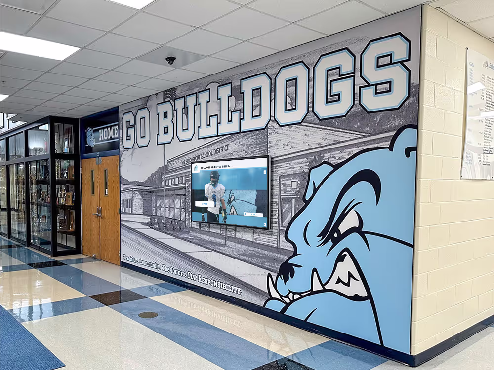
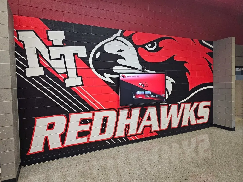
![]()
Mascot logos translate effectively from yearbook pages to large-format murals and digital display backgrounds
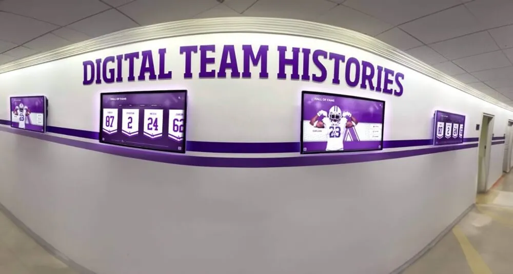
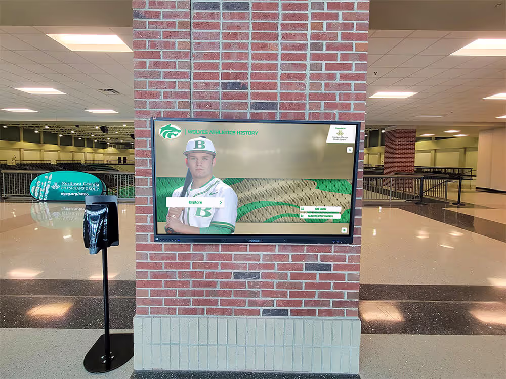
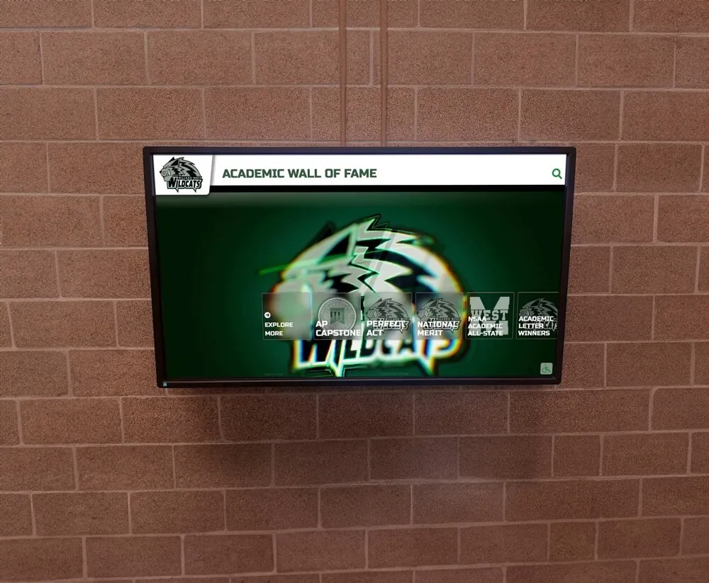
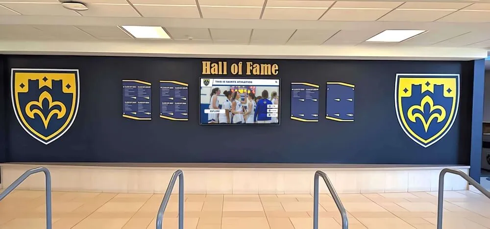
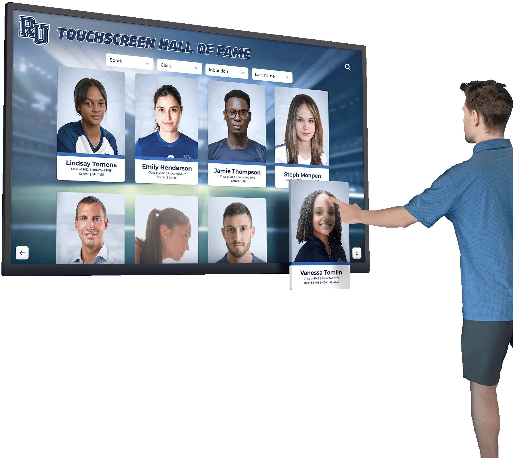
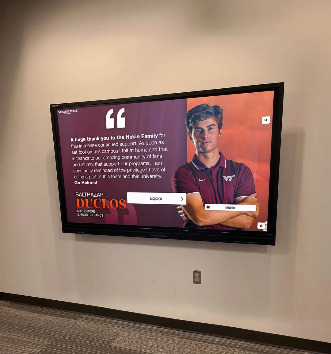
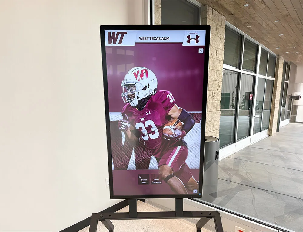
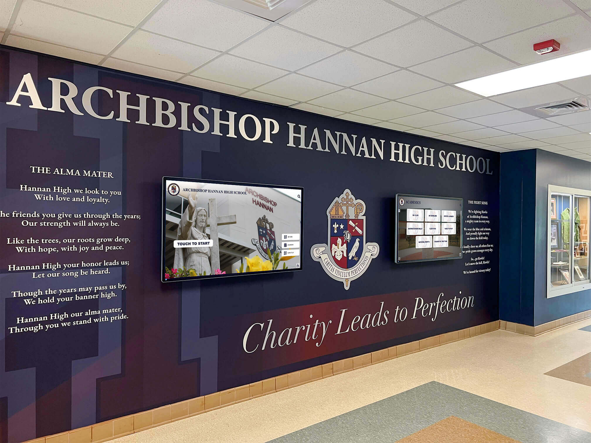
Digital Displays and Touchscreen Recognition Walls
As schools invest in managing digital brand assets for recognition displays, your school logo becomes the persistent brand anchor on every screen. Unlike print, digital environments require:
- Transparent PNG versions that layer cleanly over photo backgrounds
- Optimized file sizes that don’t slow down digital signage systems
- Color-corrected RGB values for accurate reproduction across different screen types
- Animated logo versions for dynamic digital presentations on video walls
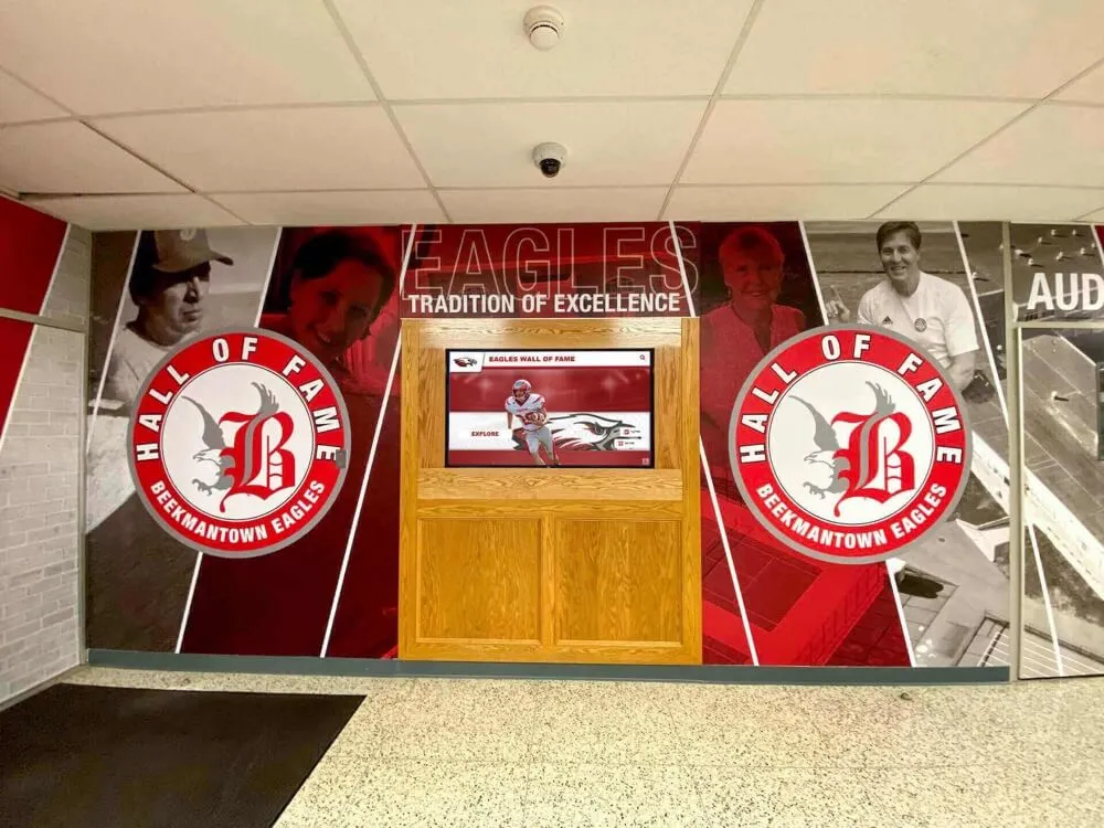
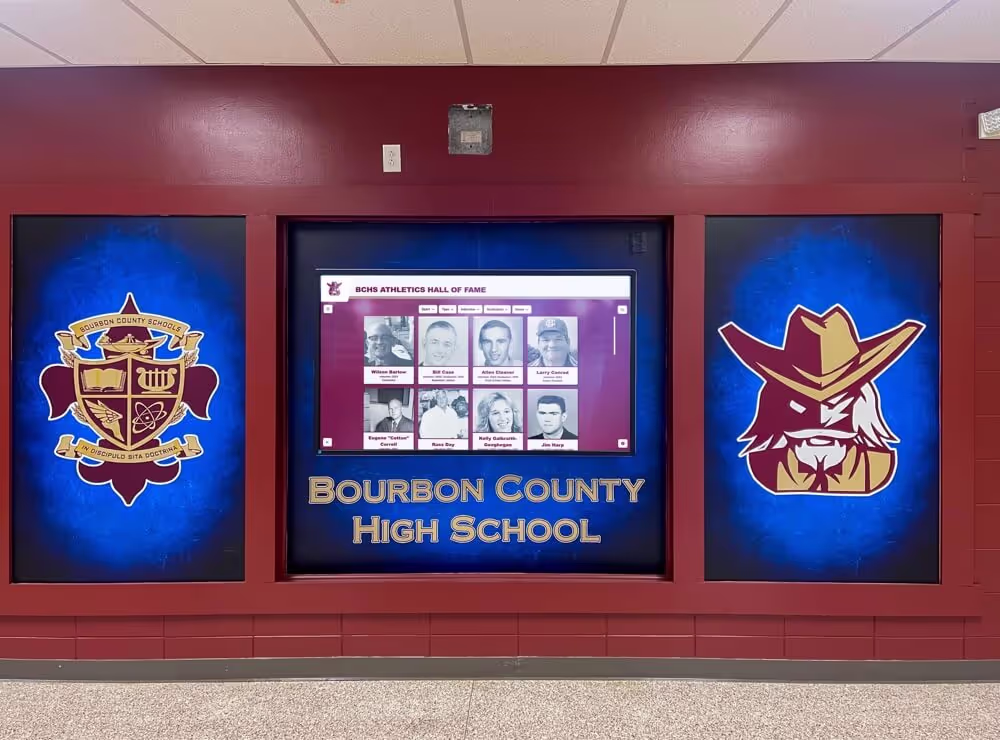
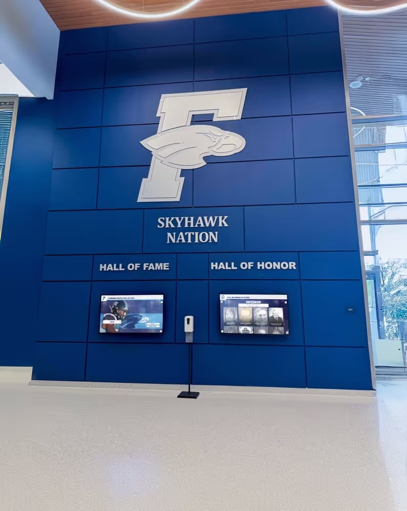
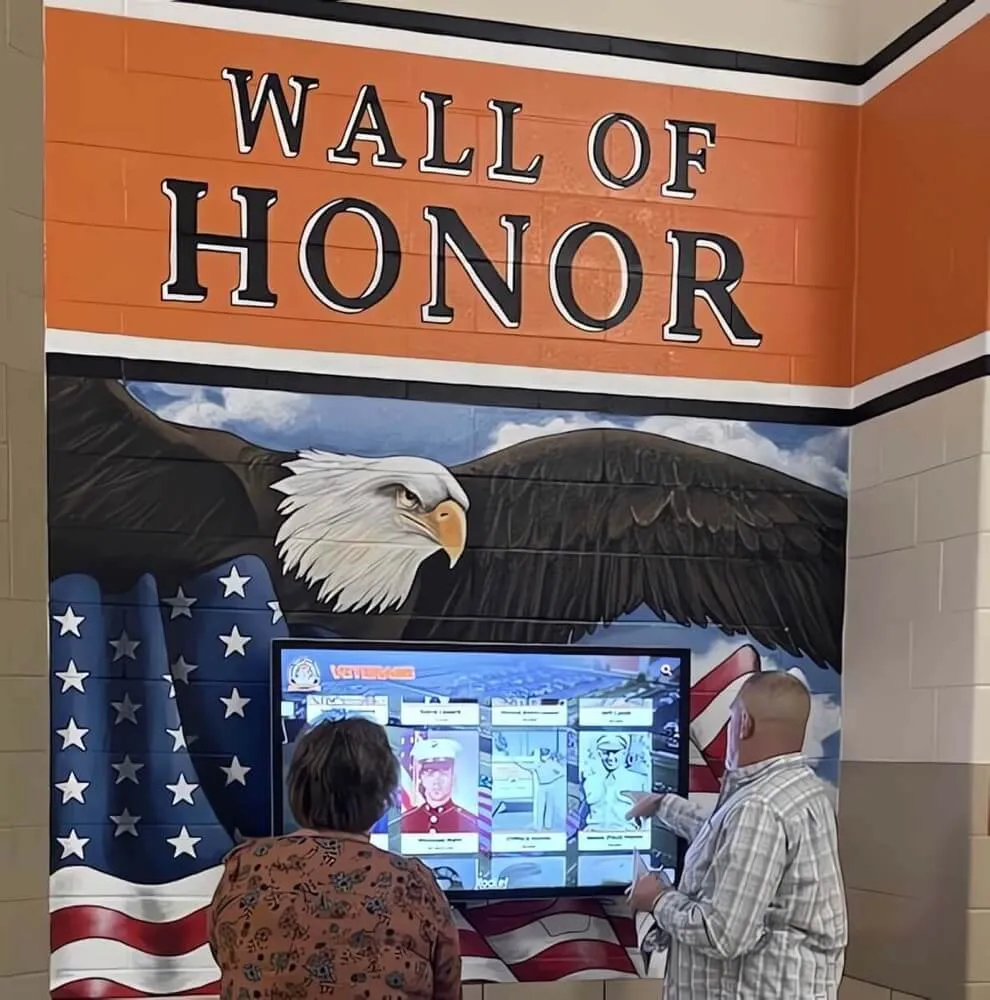
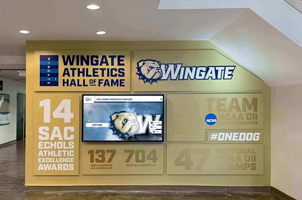
Touchscreen hall-of-fame walls, interactive kiosks, and digital recognition displays all use your school logo as the primary wayfinding element—the mark that tells visitors they’re looking at your school’s history. When installing interactive touchscreen hall-of-fame walls, logo placement and brand consistency determine whether the display feels like an authentic institutional achievement or a generic trophy wall.
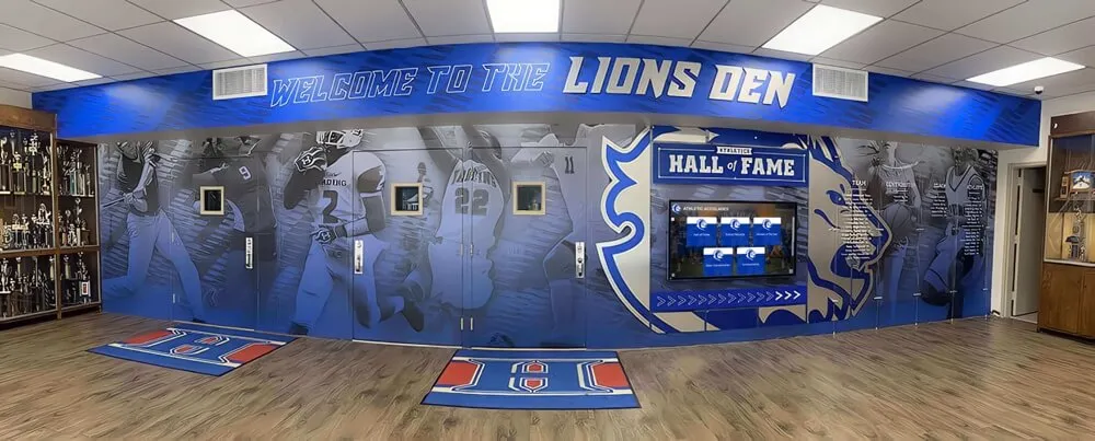
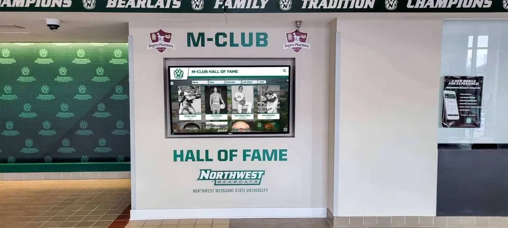
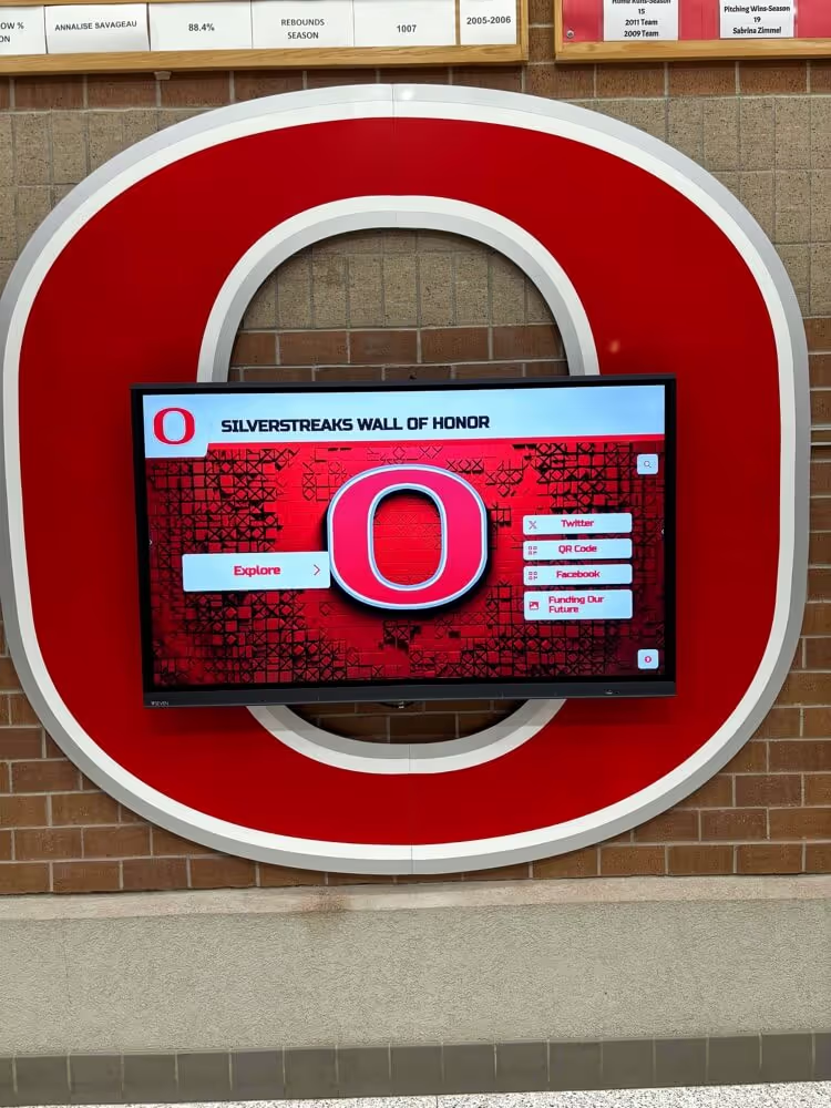
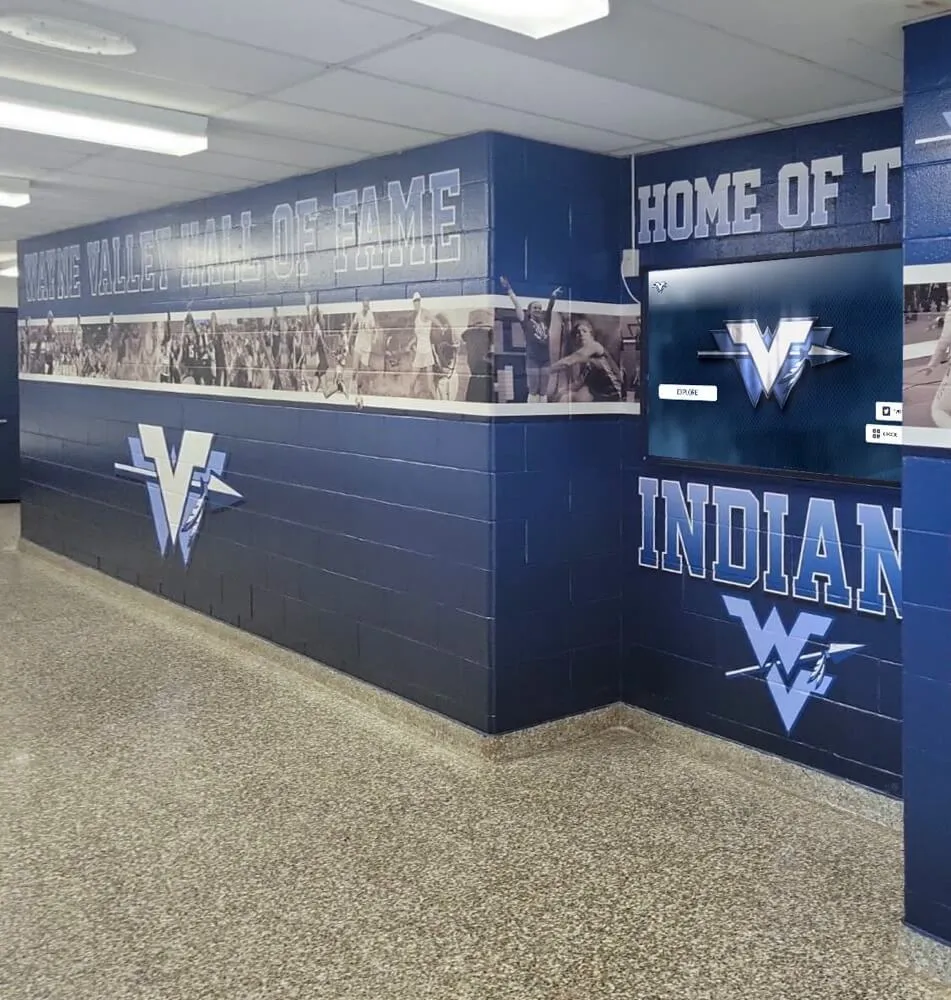
Hall-of-Fame Banners and Recognition Walls
Physical hall-of-fame installations—the banner-lined corridors and trophy case displays that greet visitors entering your school—demand logo reproduction at scales most digital designers never consider. A logo that looks sharp on a website header may appear blocky and pixelated printed at ten feet wide.
Large-format logo requirements:
- Vector artwork (AI, EPS, or SVG) is mandatory—raster files pixelate at banner scale
- Minimum 300 DPI at intended print size for any raster elements within the logo
- Color profile converted to CMYK or specified Pantone values for accurate ink reproduction
- Bleed and safe zone guidance provided to banner printers
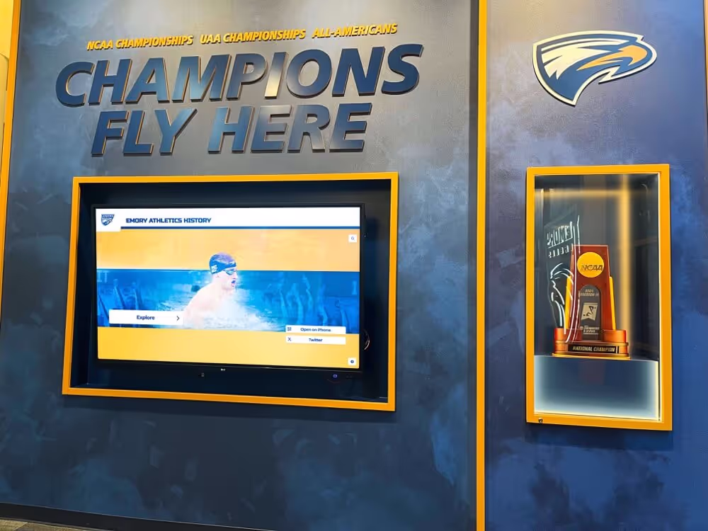
Schools investing in digital walls of achievement find that consistent logo presentation across physical and digital recognition surfaces creates significantly stronger brand impact than treating each installation as a separate design project.
Athletic Uniforms and Spirit Wear
Athletic applications place unique technical constraints on logo design:
- Embroidery: Requires simplified versions with fewer tiny details; minimum stitch counts apply
- Screen printing: Multi-color builds add cost; logos should work in 1-2 colors when needed
- Sublimation printing: Full-color digital capability but requires specific file format requirements
- Heat transfer: Needs clean edges and solid fills similar to screen printing constraints
Designing with athletic constraints in mind from the start produces logos that hold up across all applications rather than requiring expensive custom adaptations for each new uniform cycle.
Alumni Merchandise and Donor Recognition
Alumni engagement depends heavily on a school logo alumni actually want to wear and display. Academic recognition programs and induction ceremonies demonstrate that alumni connect most strongly to the school identity they experienced during their years as students—not a generic institutional mark produced after they graduated.
This creates an important design consideration: when refreshing school logos, maintain enough continuity with previous marks that alumni from multiple decades recognize the new logo as an evolution rather than a replacement. Major rebrands that completely abandon historical marks often face alumni resistance that undermines the engagement goals driving the rebrand in the first place.

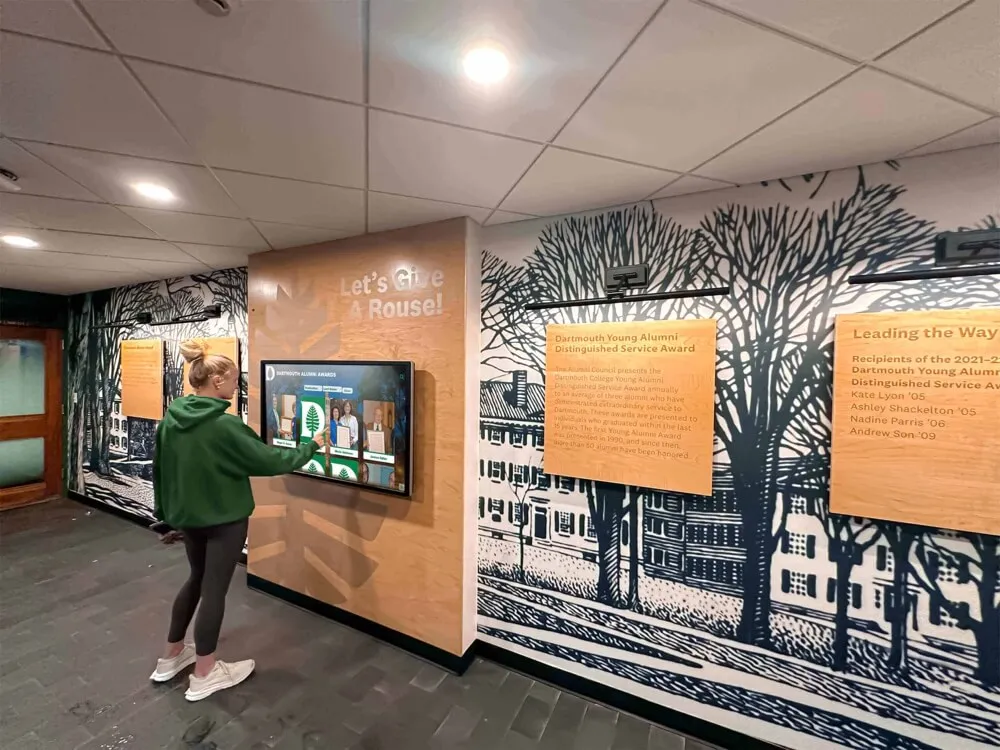
Mascot logos anchoring hall-of-fame murals create powerful physical brand statements connecting current students with school history
Building Your School Brand Style Guide
A logo without guidelines isn’t a brand—it’s just an image file waiting to be misused. A brand style guide transforms your school logo into a consistent, manageable identity system that every department and vendor can follow.
What a School Brand Style Guide Covers
Logo usage rules:
- Approved logo variations (full color, reversed, single color, black/white)
- Clear space requirements (minimum whitespace around the logo that must remain unobstructed)
- Minimum size specifications for print and digital contexts
- Prohibited uses (stretching, rotating, recoloring, using partial logo elements)
Color system:
- Primary and secondary palette with CMYK, RGB, HEX, and Pantone values
- Approved color combinations for different background contexts
- Inaccessible combinations to avoid (particularly important for digital accessibility compliance)
Typography:
- Primary headline font with weight specifications
- Body/supporting font selection
- Font pairing guidelines and hierarchy examples
Photography and imagery style:
- Action photography standards for athletics
- Portrait standards for recognition displays
- Background and environment standards for digital applications
Tone and voice:
- How the school communicates in captions, taglines, and descriptions that accompany the logo
Distributing Your Style Guide
A style guide only works if everyone who reproduces your logo has access to it. Modern schools maintain digital brand portals accessible to:
- Yearbook staff and advisers
- Athletic department and booster clubs
- Student government and club leadership
- External vendors: printers, apparel companies, trophy engravers
- Digital signage and recognition wall providers
Showcasing athletic achievements and awards digitally works most effectively when every team creating physical installations works from the same brand assets rather than improvising their own interpretations.
School Logo Maker Tools and DIY Design Approaches
Not every school has budget for a professional brand agency. Several tools make it possible for communications staff or design-savvy students to develop quality school logos with the right approach and process discipline.
Digital Design Tools for Schools
Vector design platforms:
- Adobe Illustrator (industry standard, subscription-based, steep learning curve)
- Inkscape (free, open-source vector editor suitable for skilled student designers)
- Affinity Designer (one-time purchase, professional-grade capability)
Online logo makers and school branding tools:
- Canva (widely accessible, limited true vector export options but excellent for quick brand material variations)
- AI-powered graphics platforms designed for school communications—AI school graphics guides can help supplement professional logo design with consistent branded content across digital channels
Important limitation: Most web-based school logo maker tools produce raster or low-resolution vector outputs unsuitable for large-format printing. Before committing to any design created in an online tool, verify you can export true vector SVG or EPS files.
When to Hire a Professional Designer
DIY logo design makes sense for:
- Temporary event logos (homecoming, alumni weekend, spirit week)
- Supporting brand assets: social media templates, email headers, event programs
- Logo variations and updates that don’t change the core mark
Hire a professional when:
- Creating the primary school logo that will appear on uniforms, buildings, and official communications
- Undergoing a full institutional rebrand
- Developing a complete brand system including typography, color system, and style guide
- The logo needs to work across major dimensional applications: gymnasium court stencil, building signage, monument sign
The cost of professional school logo design ($2,000–$15,000 depending on scope) is modest compared to the decades of use the resulting mark sees across thousands of applications at every scale.
Working with Student Designers
Many schools run student logo design competitions or involve art and graphic design classes in identity development. This approach builds community ownership and develops student skills—but requires clear structure to be successful:
Making student design processes work:
- Professional art director review of student submissions before finalist selection
- Clear technical specifications in the design brief (vector delivery, color requirements, scale testing requirements)
- Adequate compensation or academic credit for student designers whose work is used commercially
- Rights assignment documentation ensuring the school owns the final artwork
Modern digital trophy case systems that showcase student creative work—including design projects like logo development—build institutional pride while developing the next generation of visual communicators.

Cardinal mascot and school colors applied to digital hall displays demonstrate how effective logo design scales from small screens to large corridor installations
Logo Design for Specific School Contexts
Different school contexts create different logo design priorities and constraints worth understanding before beginning the design process.
Elementary Schools
Elementary school logos lean toward accessibility and warmth:
- Simpler, more approachable mascot illustrations (less aggressive, more friendly)
- Brighter, higher-saturation color palettes
- Rounder, more welcoming typography choices
- Designs that feel inclusive to young children rather than intimidating
Middle Schools
Middle school identity design bridges elementary approachability and high school competitive energy:
- Emerging mascot identity tied to athletic programs beginning to develop
- Typography gaining more personality while remaining accessible
- Color systems becoming more sophisticated
- A bridge between “school as community” (elementary) and “school as team” (high school)
High Schools
High school logo design carries the strongest expectations:
- Athletics, college prep, tradition, and student identity all compete for design emphasis
- Alumni expectations are most intense—alumni identify most strongly with their high school brands
- Multiple applications (yearbook, athletics, academics, performing arts) must be served simultaneously
- The logo needs to work on graduation ceremony materials, college applications, and alumni merchandise decades into the future
Colleges and Universities
University logo design operates at the most complex level:
- Multiple colleges, departments, and programs within a single institution require sub-brand systems
- Athletics marks (often managed separately by the athletics department) must coexist with academic marks
- Accreditation materials, alumni relations, and fundraising applications demand institutional gravitas
- Digital applications span from academic journals to mobile apps
Deploying Your School Logo on Digital Recognition Infrastructure
The most compelling contemporary application of school logo design—and one where consistent, professional artwork makes an immediate visible difference—is digital recognition infrastructure throughout the campus.
Modern schools are replacing static trophy cases and paper honor rolls with interactive touchscreen displays showcasing student achievements, athletic records, hall-of-fame inductees, and institutional history. Your school logo serves as the visual anchor on every screen in these systems.
Digital Hall-of-Fame Walls
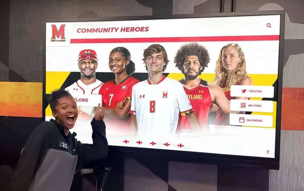
Touchscreen hall-of-fame installations present school logos alongside athlete portraits, championship records, and alumni spotlights on large-format interactive displays. When your logo artwork is professionally prepared with transparent backgrounds and proper color profiles, these displays create cohesive brand experiences that honor your school’s legacy while serving current students and families visiting campus.
End-of-year recognition program guides and lobby design experts consistently identify the entry experience as the highest-impact branding moment a school has—when visitors first encounter the school’s visual identity in full expression. A well-prepared school logo transforms that moment from a generic institutional encounter into an emotionally resonant brand experience.
Digital Yearbooks and Archive Systems
When yearbooks exist only as physical books, your school logo appears on a limited number of produced copies. Digital yearbook platforms and archive systems extend that logo’s reach infinitely—accessible to alumni anywhere, embeddable in virtual recognition walls, and displayable on digital screens throughout the building year-round.
The school logo becomes both the navigation anchor (orienting viewers within the digital archive) and the emotional touchstone connecting alumni to their school experience across decades of institutional history.
Common School Logo Design Mistakes (and How to Fix Them)
Using Clip Art or Stock Mascots
The most pervasive school logo mistake is using generic clip-art mascots available in any stock illustration library. When your “eagles” logo is the same eagle used by 200 other schools, the mark fails its primary job: creating distinctive identity.
Fix: Commission original mascot illustration even if it requires modest budget. The distinguishing quality of original artwork—subtle details that make your eagle specifically your eagle—pays dividends across decades of use.
Designing Only for Small Applications
Designing a logo at 200px × 200px on a computer produces something that looks sharp on a website but falls apart on a gymnasium banner.
Fix: Test every logo design at three scales during the design process:
- Small (2 inches wide): social media profile icon, yearbook spine
- Medium (8–12 inches): jersey emblem, program cover
- Large (4–10 feet): gymnasium banner, lobby mural, building signage
Inconsistent Color Across Applications
When the yearbook’s navy is slightly different from the athletic department’s navy, which is slightly different from the PTA’s navy, the school brand fragments into competing versions of itself across every surface.
Fix: Establish official Pantone, CMYK, RGB, and HEX values for every color in your palette. Distribute these values to every vendor through your brand style guide as a non-negotiable production requirement.
Too Many Colors
School logos with five or six colors seem vibrant in original digital form but become expensive nightmares in embroidery, screen printing, and single-color reproduction scenarios.
Fix: Limit primary logos to two main colors plus black and white. Additional colors can appear in supporting brand materials but should not be required for primary logo reproduction.
No Clear Space Guidelines
Without minimum clear space requirements, other design elements crowd against your logo—subordinating it visually and preventing the dominant brand impression logos need to create.
Fix: Define clear space in terms of the logo’s own dimensions (for example, “the minimum clear space around the logo equals the height of the letter ‘H’ in the school name”). This definition scales with the logo regardless of reproduction size.
School Logo Design Deployment Checklist
Use this checklist when evaluating a new or existing school logo design before approving it for full deployment:
Scalability
- Reads clearly at 1-inch width
- Maintains impact at 10-foot banner width
- Works in single color (black only)
- Works reversed out of dark backgrounds
Versatility
- Full-color version exists
- Single-color (black) version exists
- Reversed/knockout (white) version exists
- Transparent background (PNG) version exists
- Vector formats (SVG, EPS, or AI) available for print and display use
Color System
- Pantone values assigned for all brand colors
- CMYK values specified for all print applications
- RGB/HEX values specified for digital and screen applications
- Embroidery thread numbers identified for uniform production
Typography
- Primary headline font identified and licensed
- Secondary body font identified
- Font pairing guidelines created and distributed
Documentation
- Brand style guide created and accessible to all stakeholders
- Logo files organized in a central, accessible repository
- Vendor distribution process established and documented
From Logo to Living Brand
A school logo becomes a living brand through consistent, intentional application across every student experience—from the yearbook received at year’s end to the hall-of-fame display honoring alumni achievements, from the digital signage in the main corridor to the banner above the gymnasium floor.
The schools that build the strongest community identity around their visual brand treat the logo not as a one-time design project but as an ongoing institutional asset requiring stewardship. That means annual review of brand consistency, updating vendor files when the logo evolves, training new yearbook staff on brand standards, and ensuring every new recognition installation reflects the same visual identity that alumni remember from their own years as students.
When a school’s logo travels consistently from yearbook cover to touchscreen hall-of-fame wall to alumni merchandise—recognized instantly by everyone who ever walked those hallways—it has done its job completely. The mark becomes less a graphic design artifact and more a vessel for shared memory, pride, and belonging that transcends any single graduating class.
Ready to build recognition infrastructure that showcases your school’s visual identity across interactive digital displays? Rocket Alumni Solutions creates touchscreen hall-of-fame walls, digital recognition displays, and interactive archive systems designed to present your school logo and student achievements with lasting impact—connecting current students, visiting families, and returning alumni through a unified brand experience that honors your school’s history while celebrating its future.